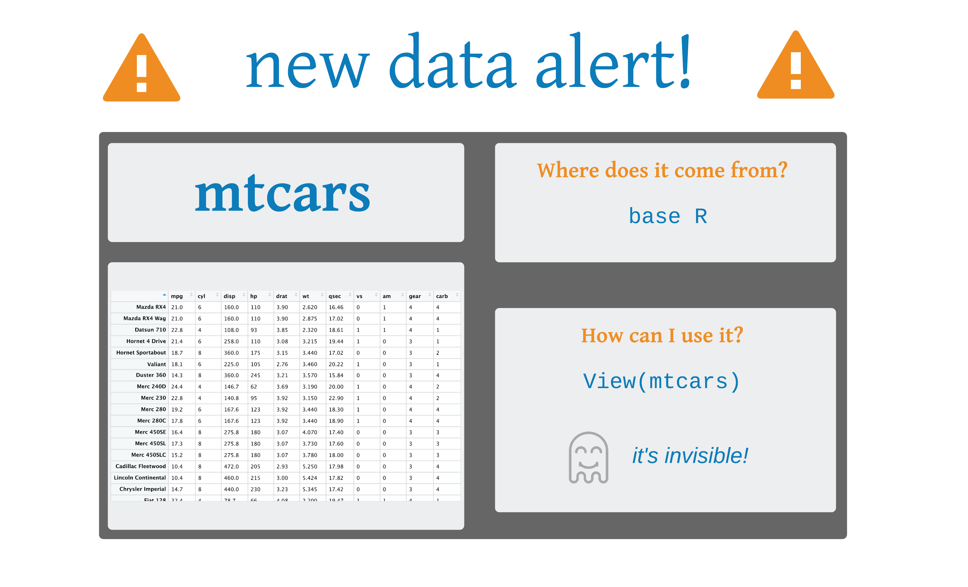
# A tibble: 32 × 11
     mpg   cyl  disp    hp  drat    wt  qsec    vs    am
   <dbl> <dbl> <dbl> <dbl> <dbl> <dbl> <dbl> <dbl> <dbl>
 1  21       6  160    110  3.9   2.62  16.5     0     1
 2  21       6  160    110  3.9   2.88  17.0     0     1
 3  22.8     4  108     93  3.85  2.32  18.6     1     1
 4  21.4     6  258    110  3.08  3.22  19.4     1     0
 5  18.7     8  360    175  3.15  3.44  17.0     0     0
 6  18.1     6  225    105  2.76  3.46  20.2     1     0
 7  14.3     8  360    245  3.21  3.57  15.8     0     0
 8  24.4     4  147.    62  3.69  3.19  20       1     0
 9  22.8     4  141.    95  3.92  3.15  22.9     1     0
10  19.2     6  168.   123  3.92  3.44  18.3     1     0
# ℹ 22 more rows
# ℹ 2 more variables: gear <dbl>, carb <dbl>Data Visualization in R
ggplot2 and the grammar of graphics
2025-08-09
Art by Allison Horst
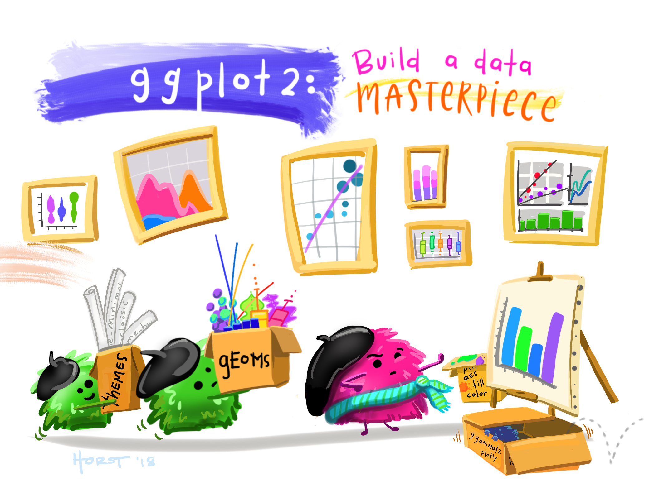
ggplot2: Elegant Data Visualizations in R
A Layered Grammar of Graphics
Data is mapped to aesthetics; Statistics and plot are linked
Sensible defaults; Infinitely extensible
Publication quality and beyond
https://nyti.ms/2jUp36n
http://bit.ly/2KSGZLu

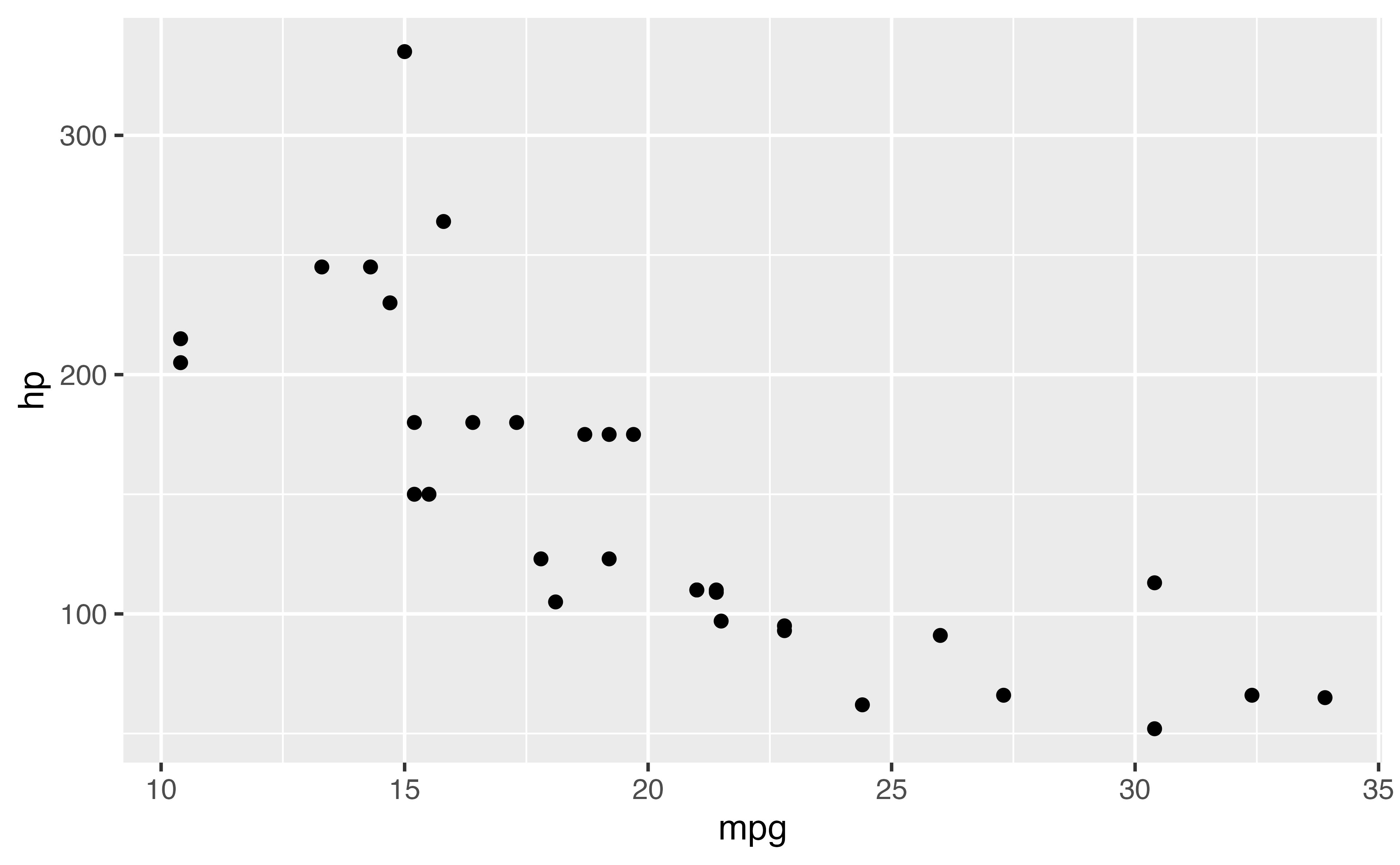
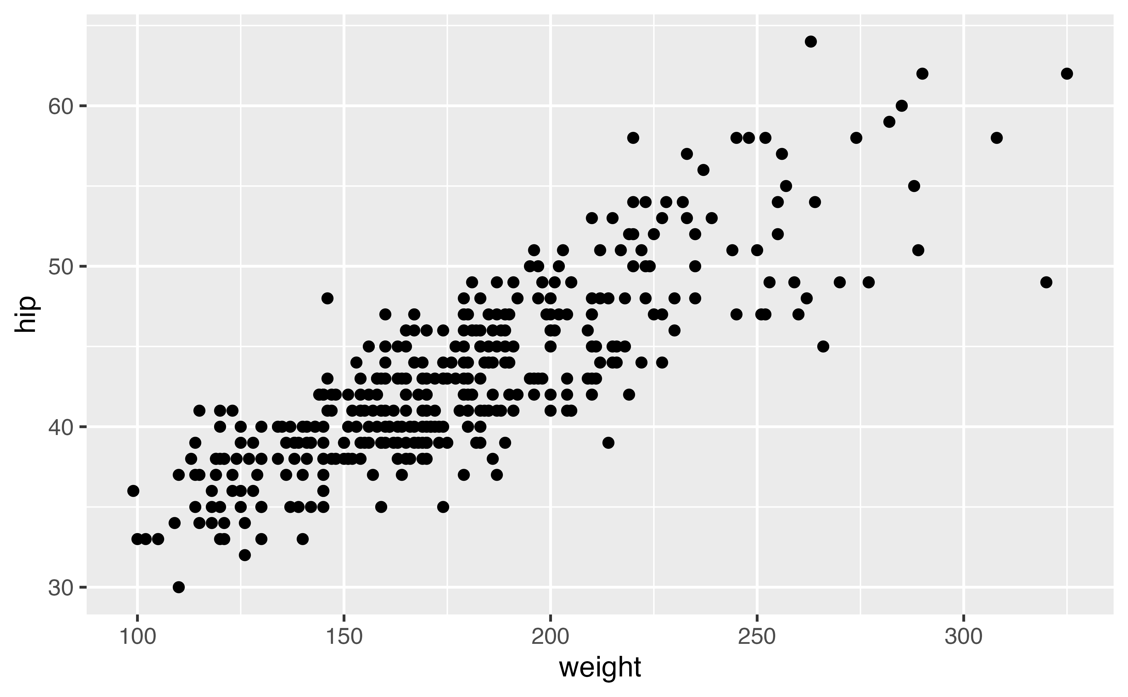

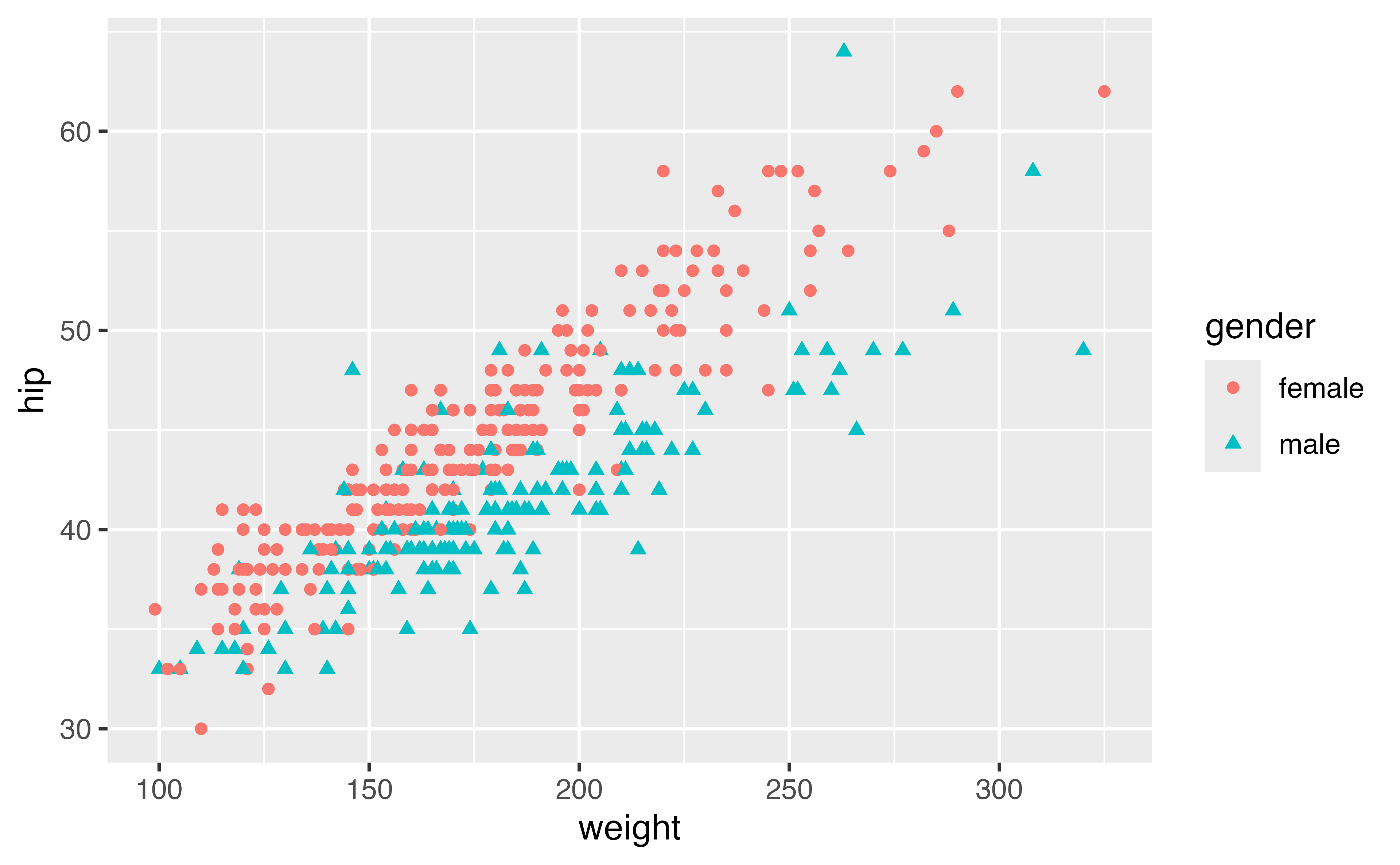
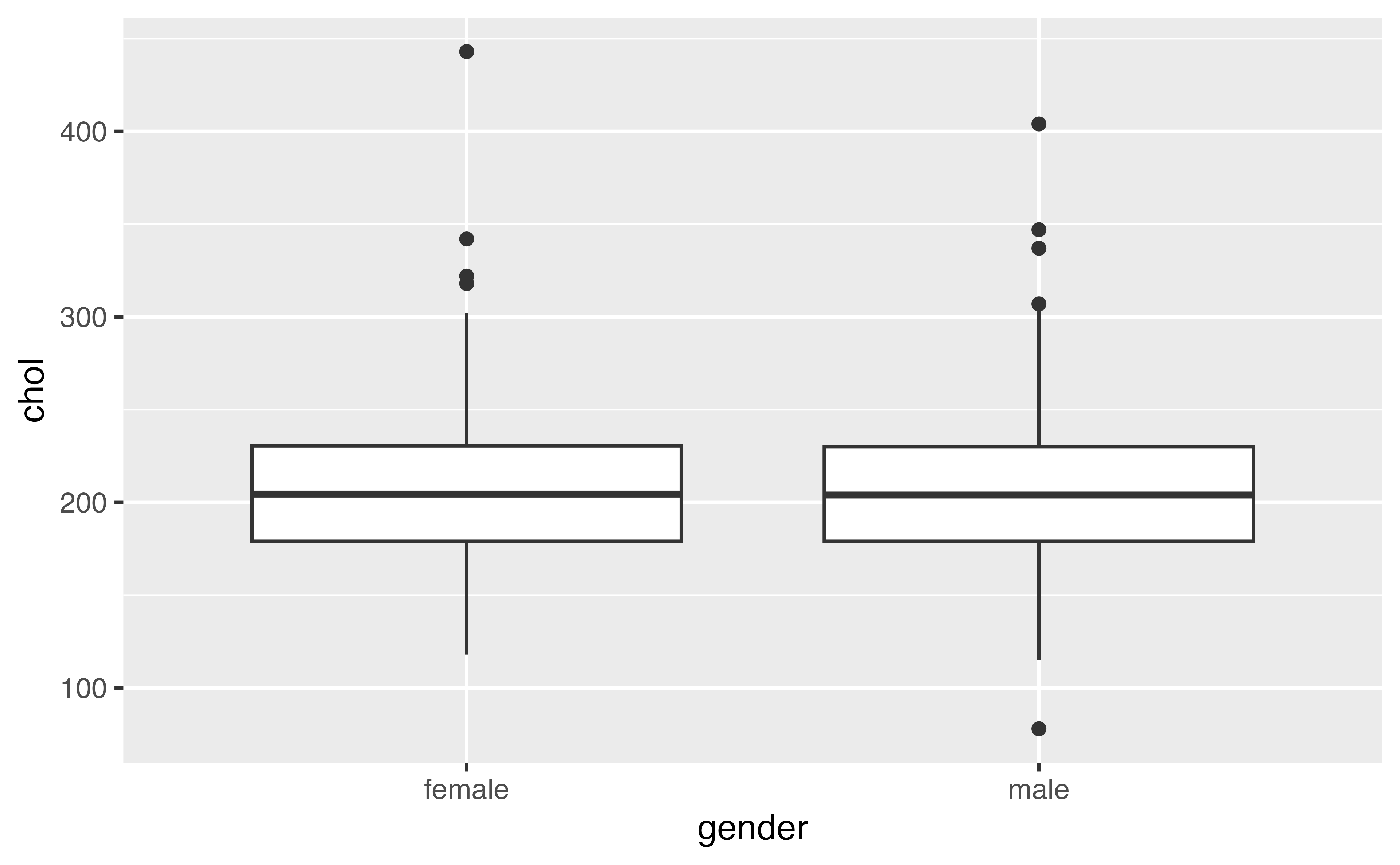
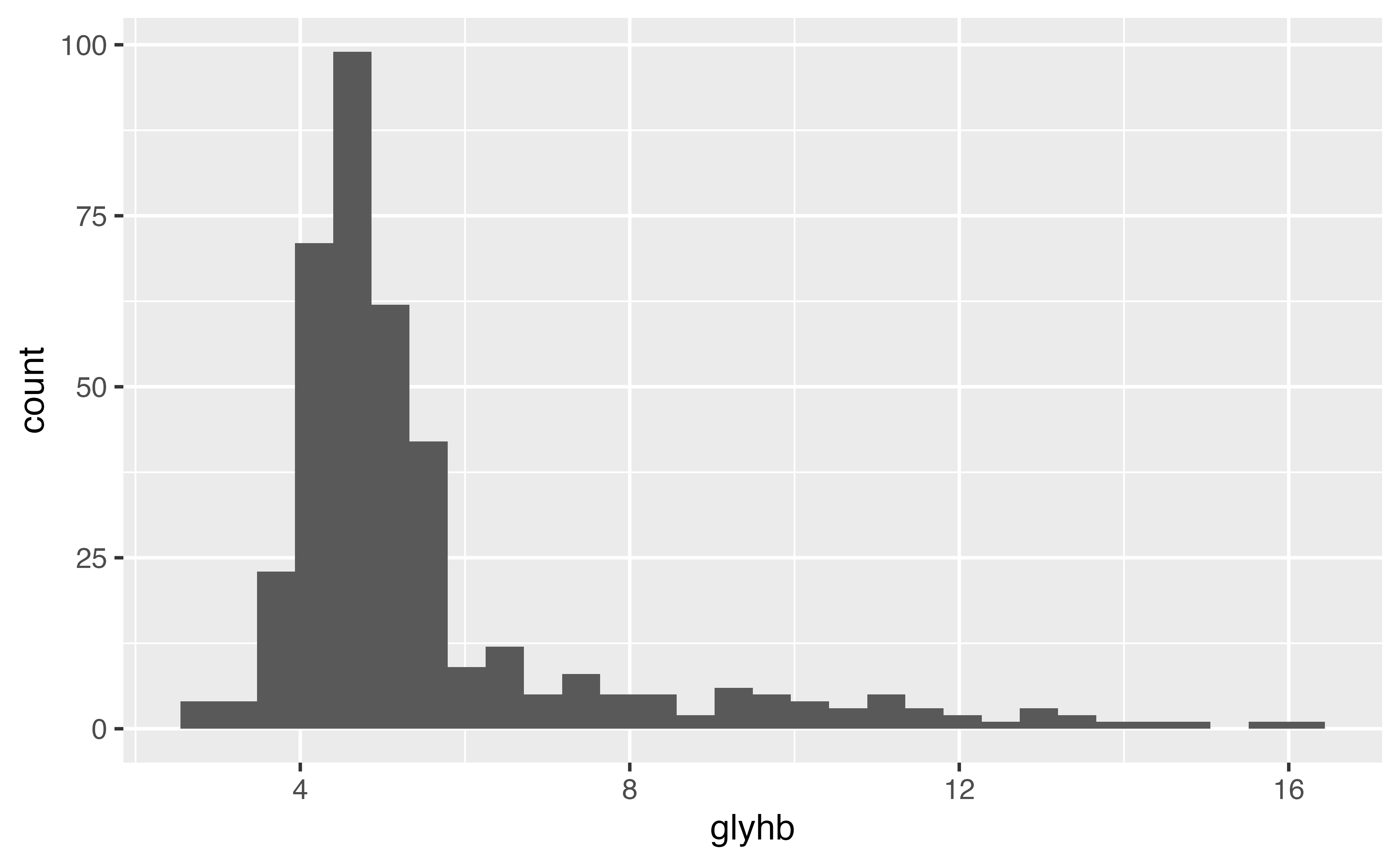
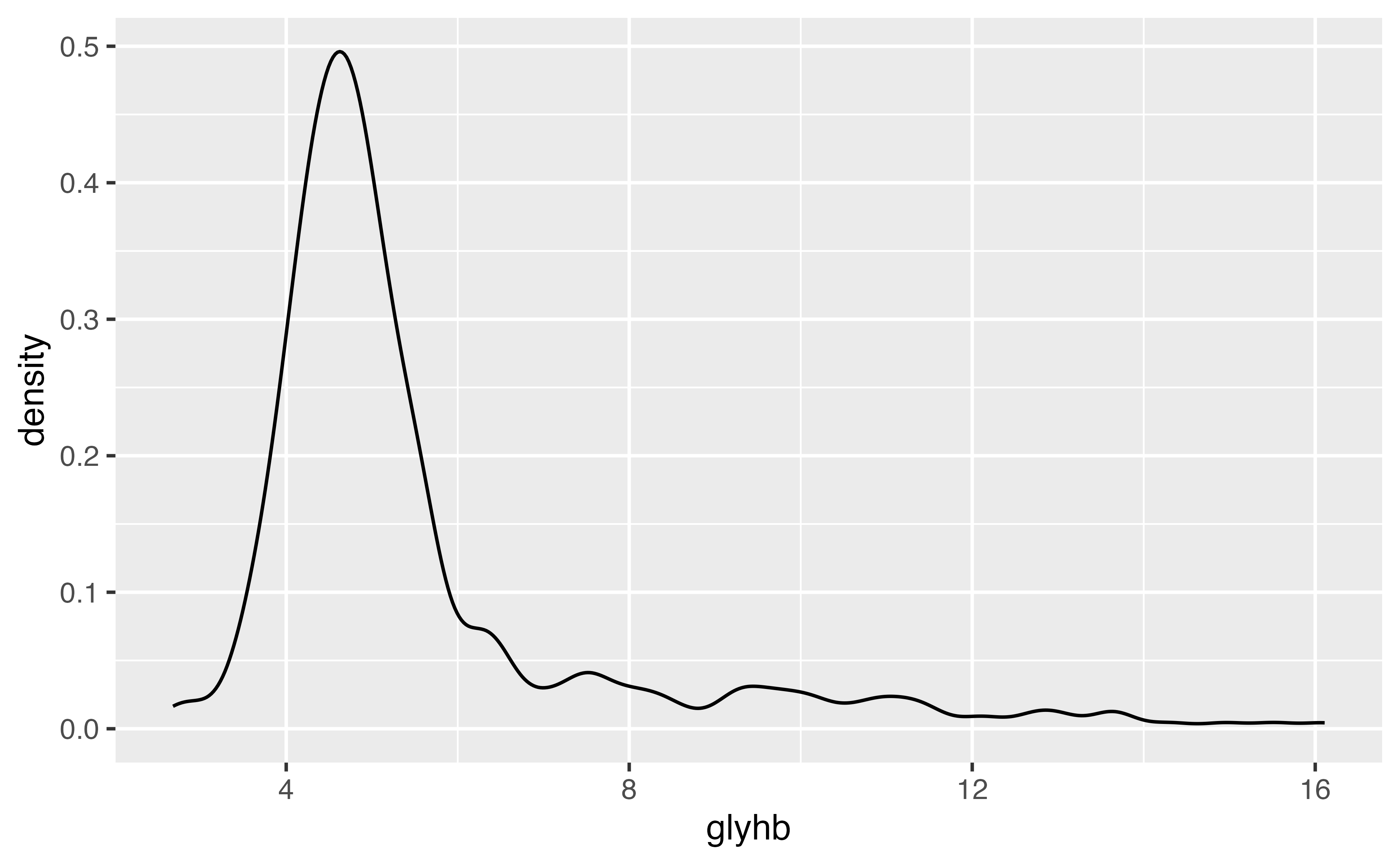
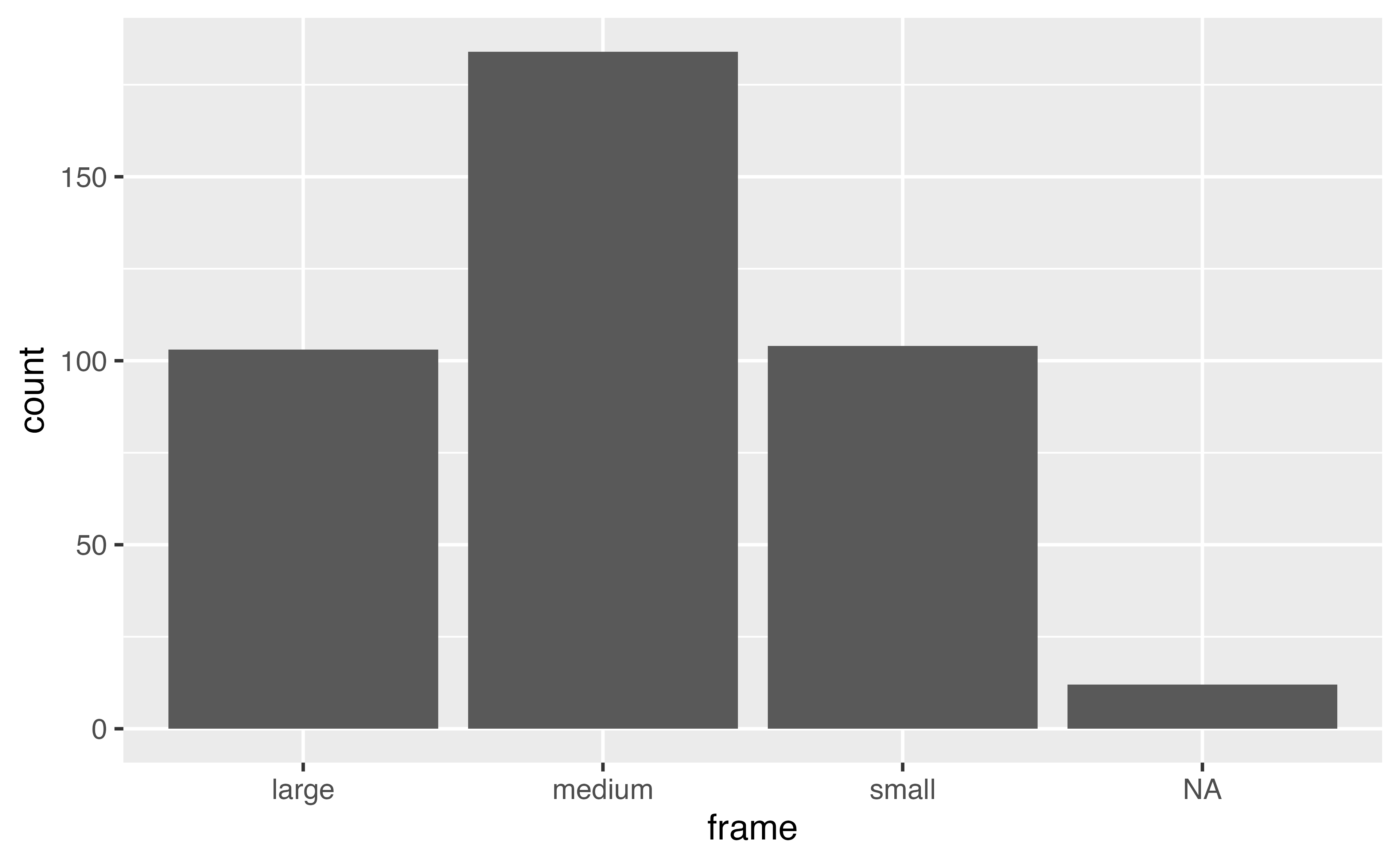
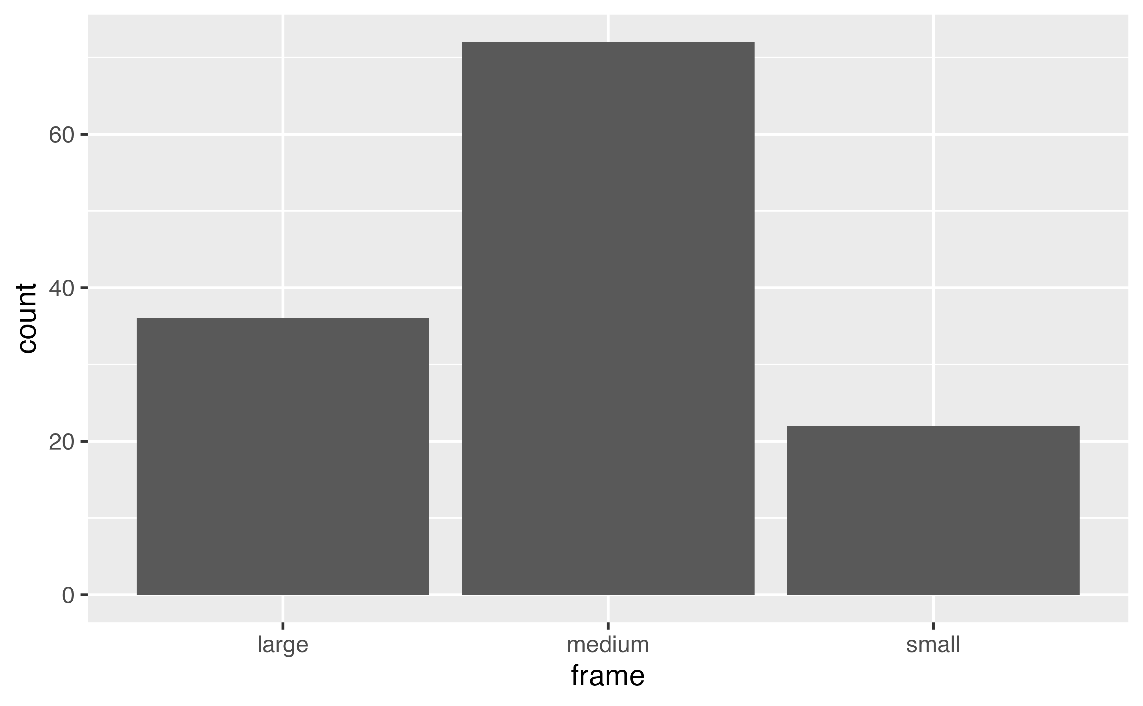
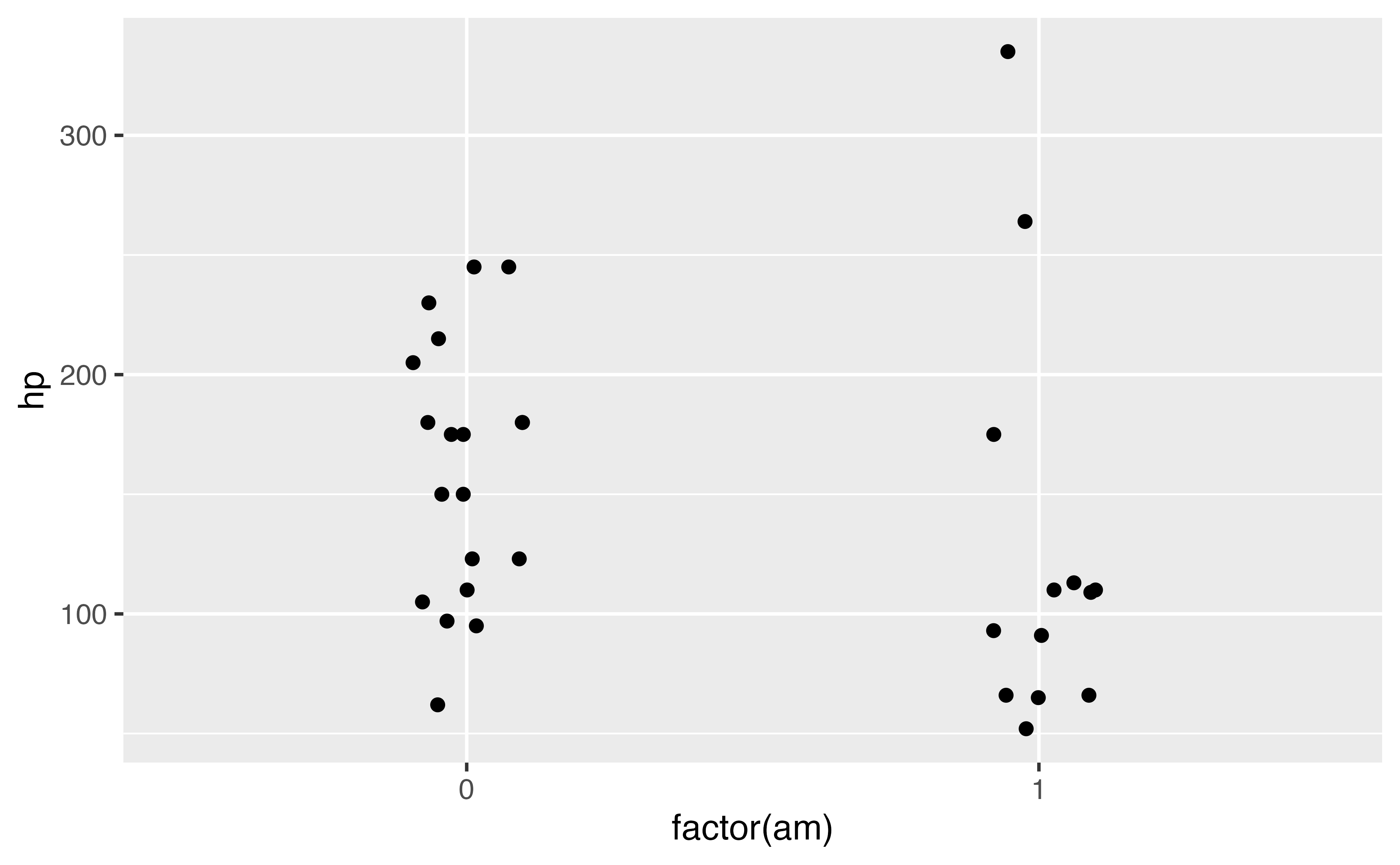
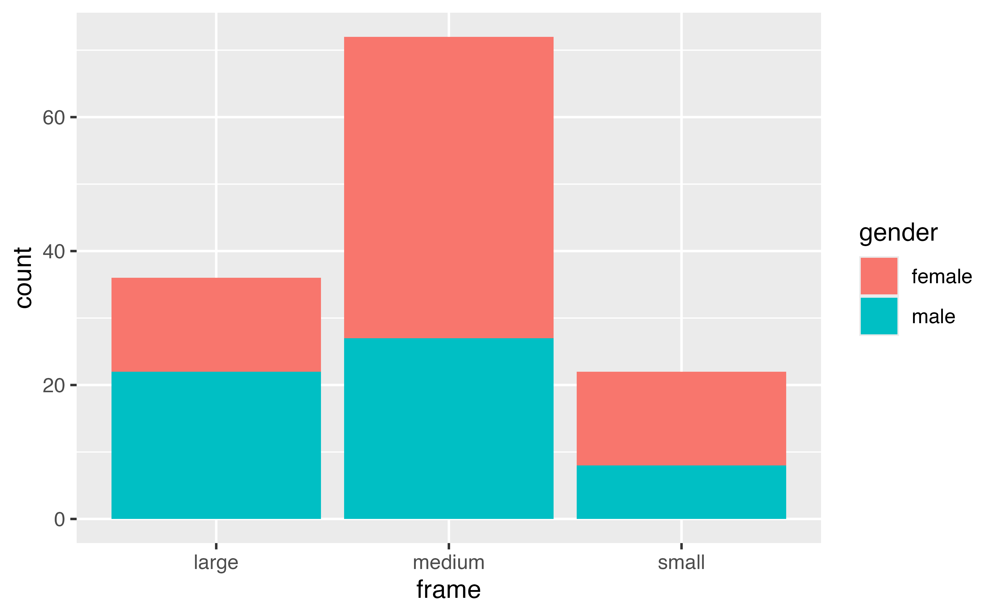
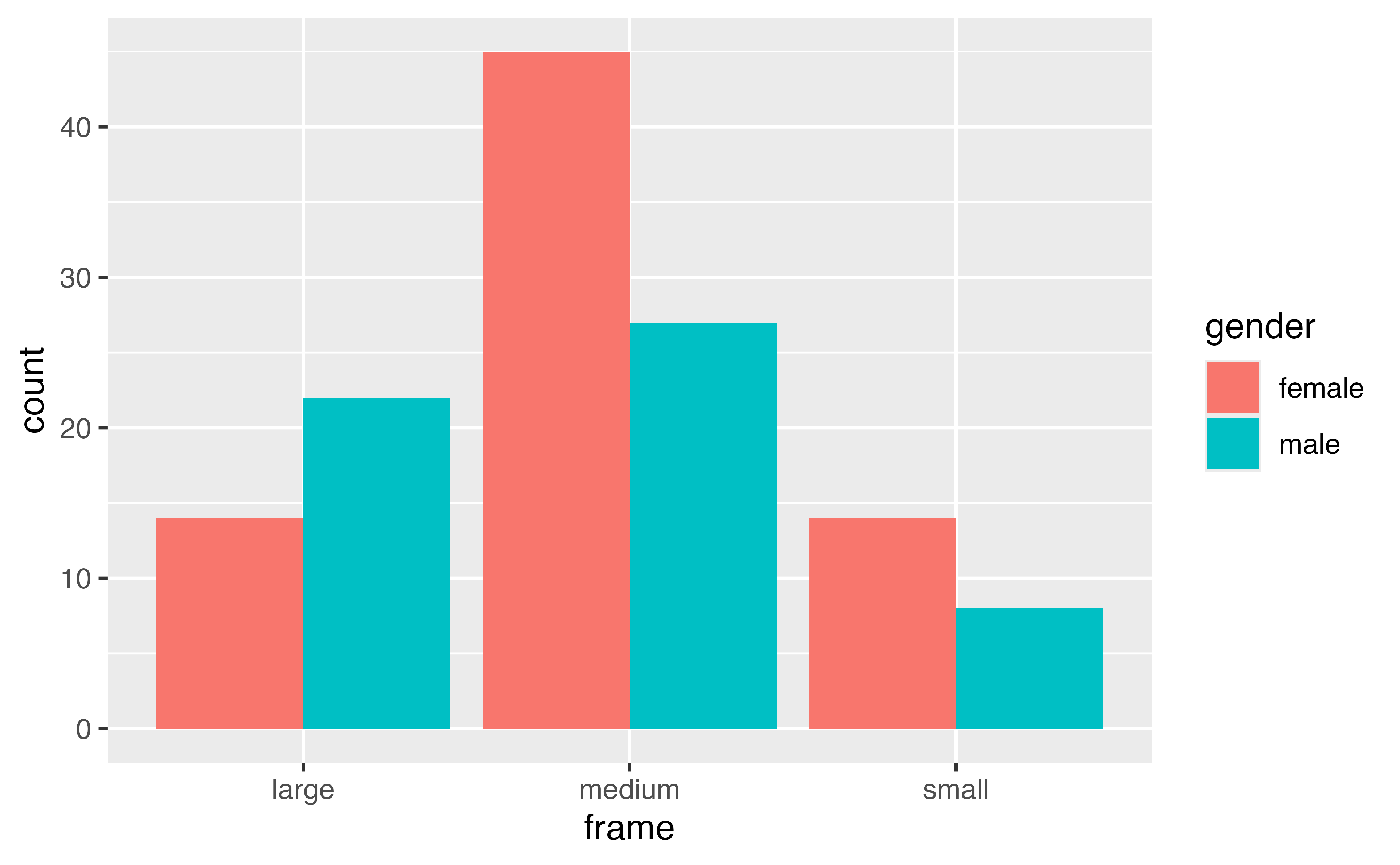
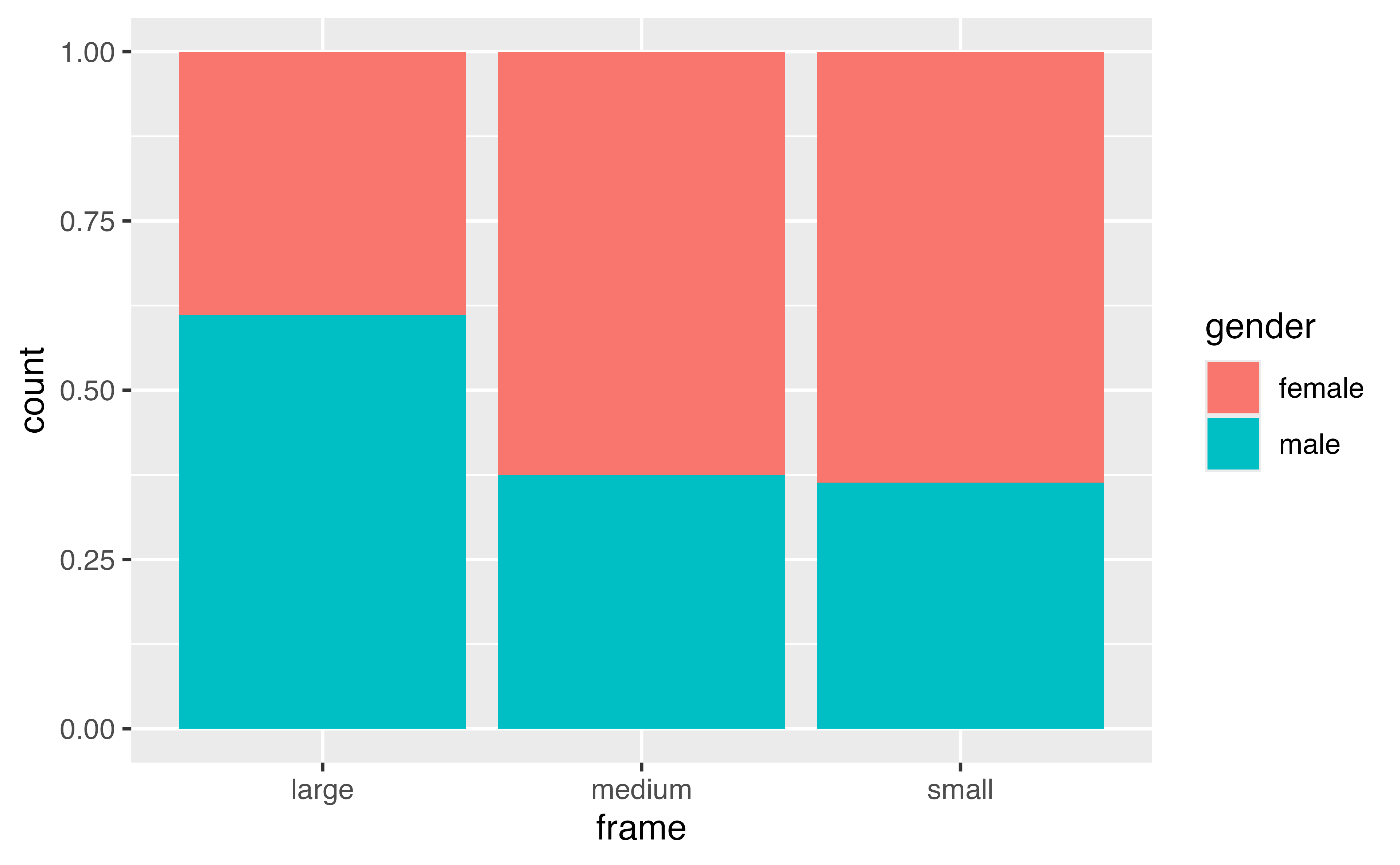
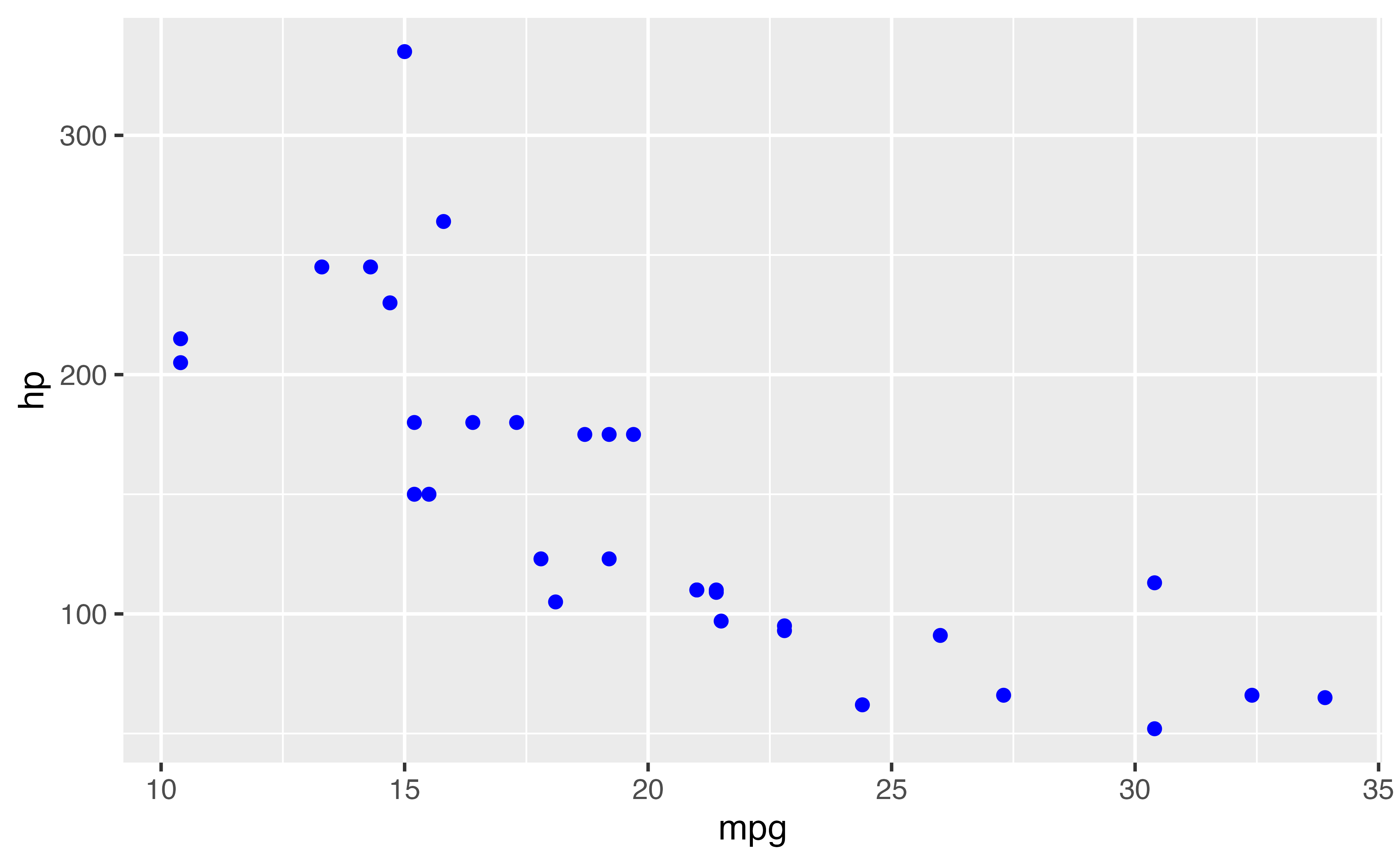
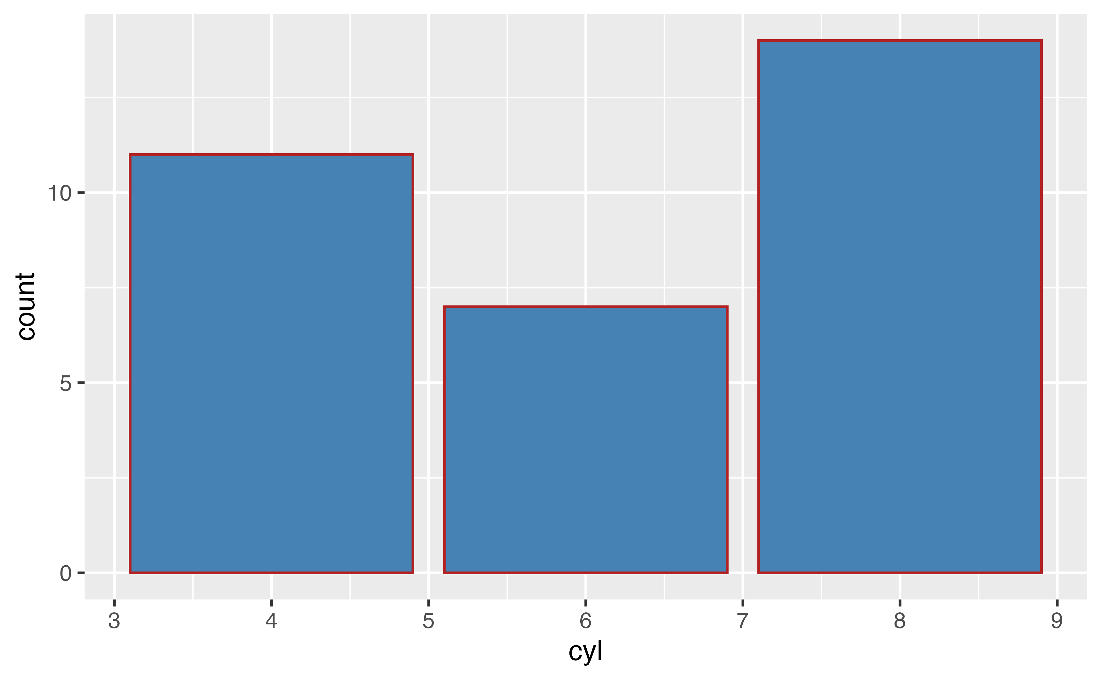
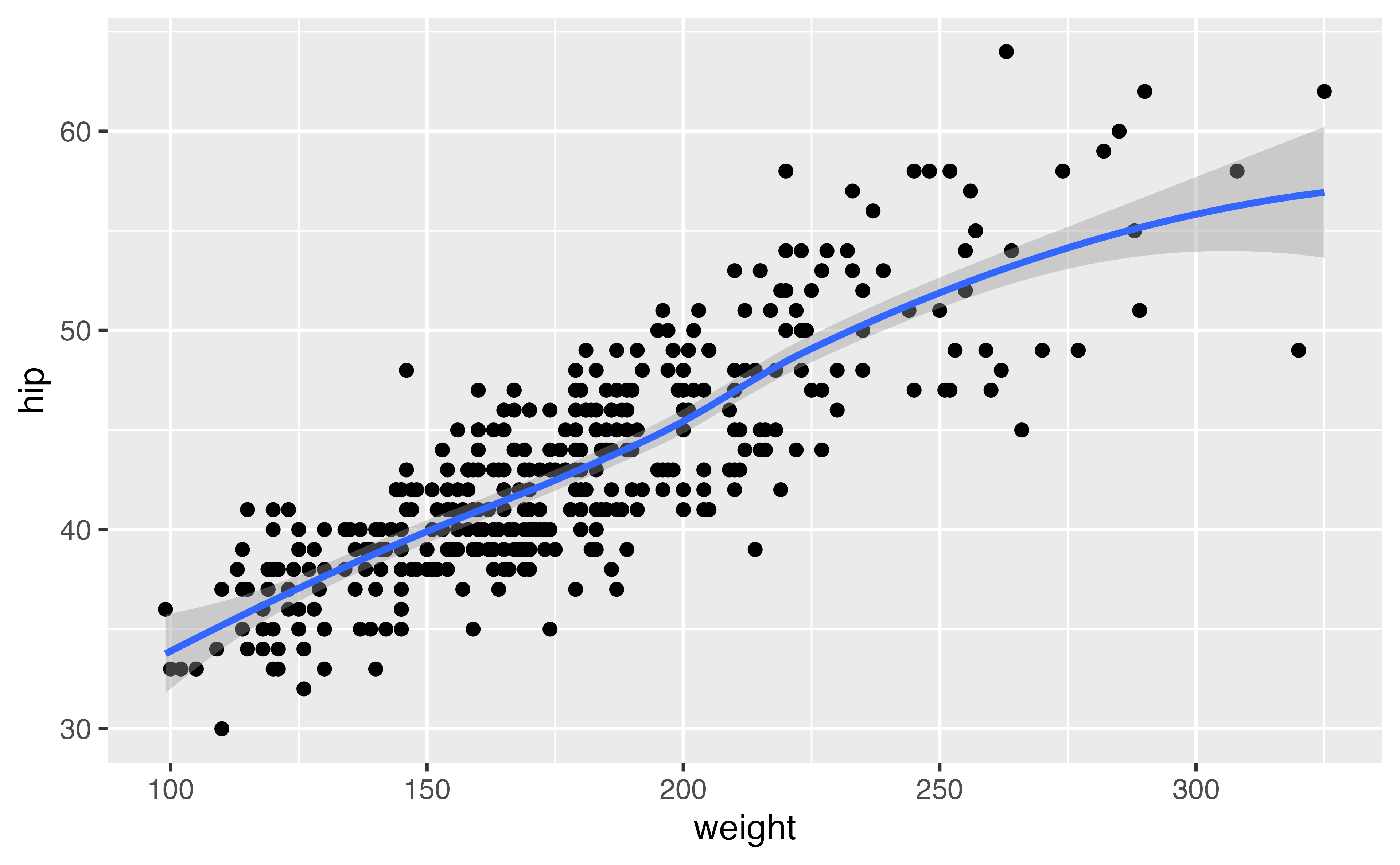
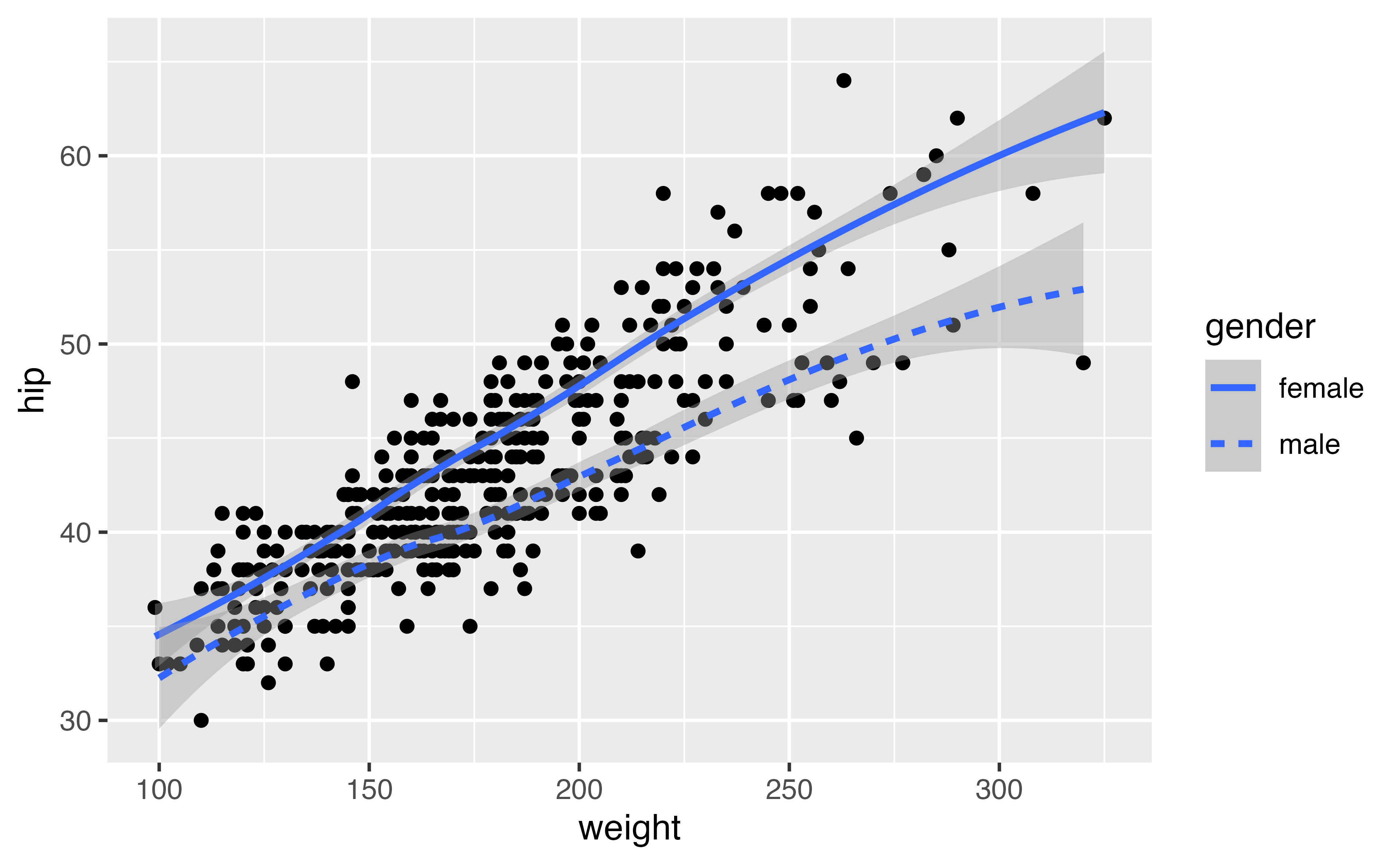
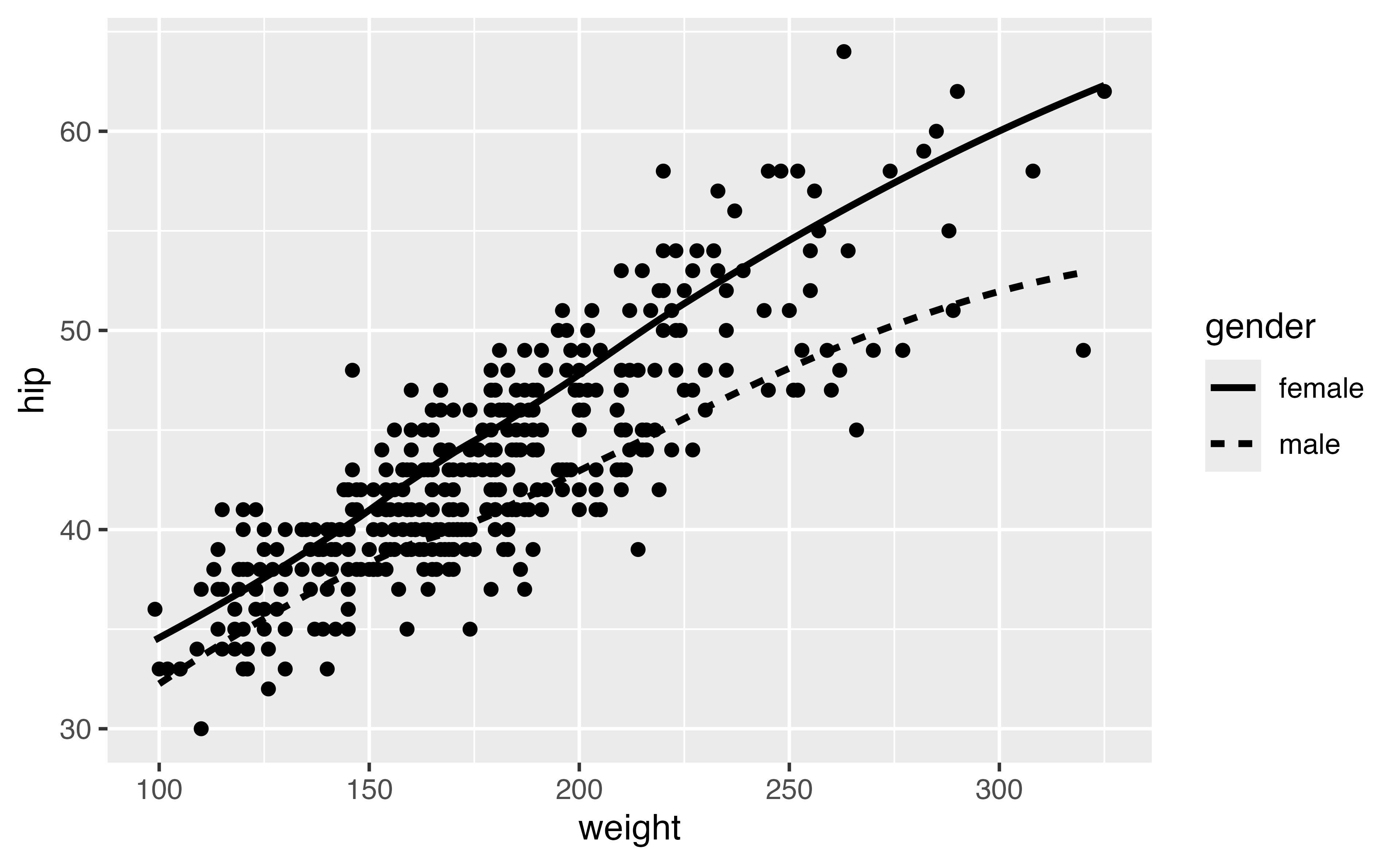
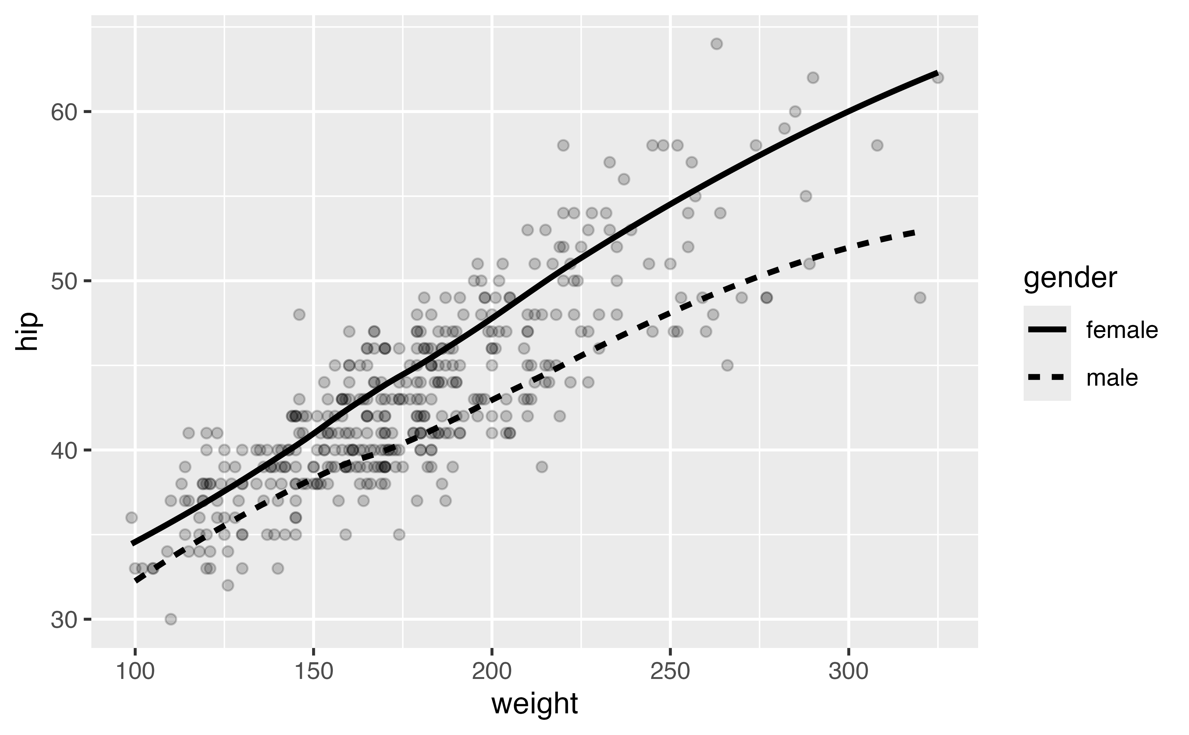
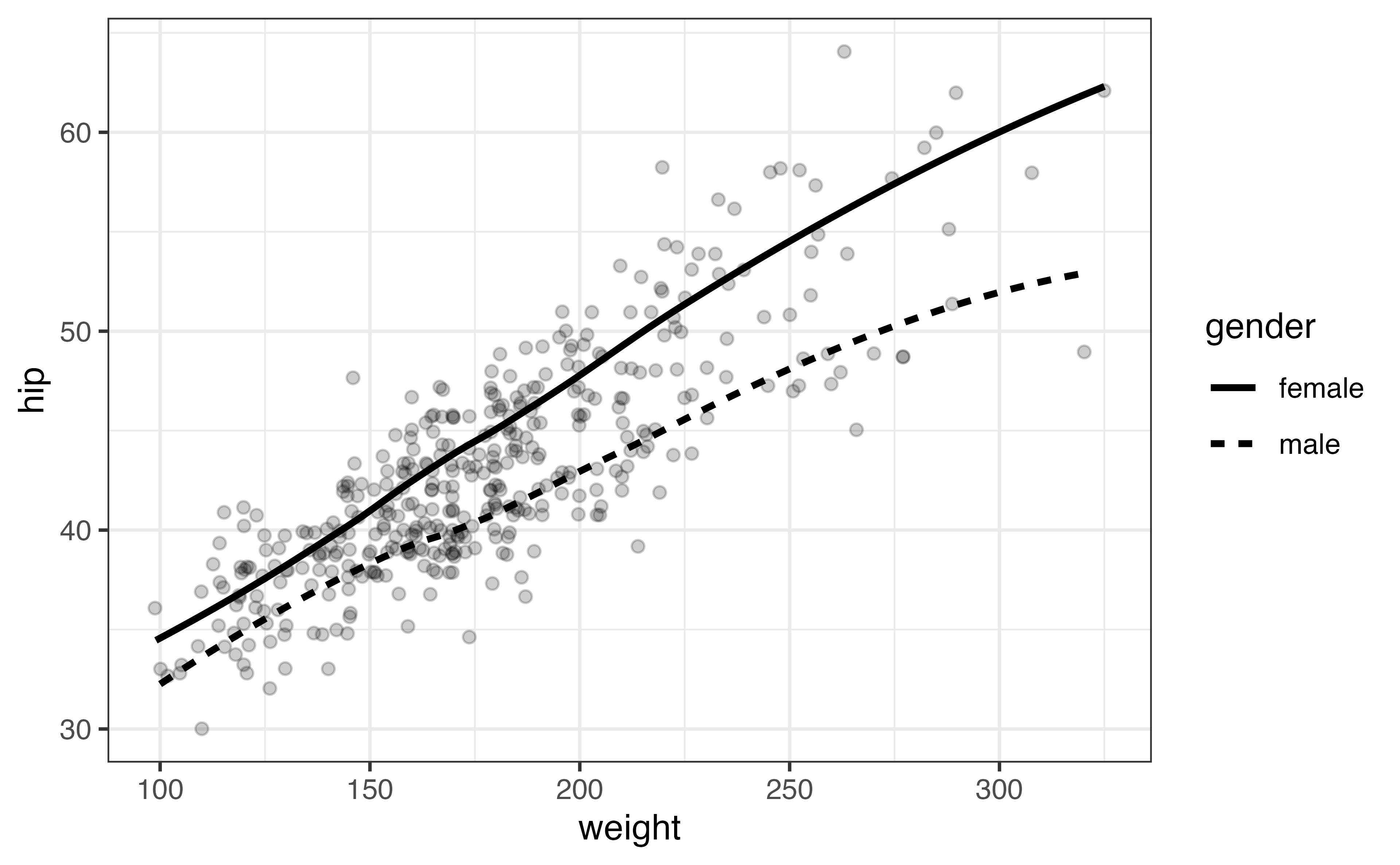
geoms: the shape of the data
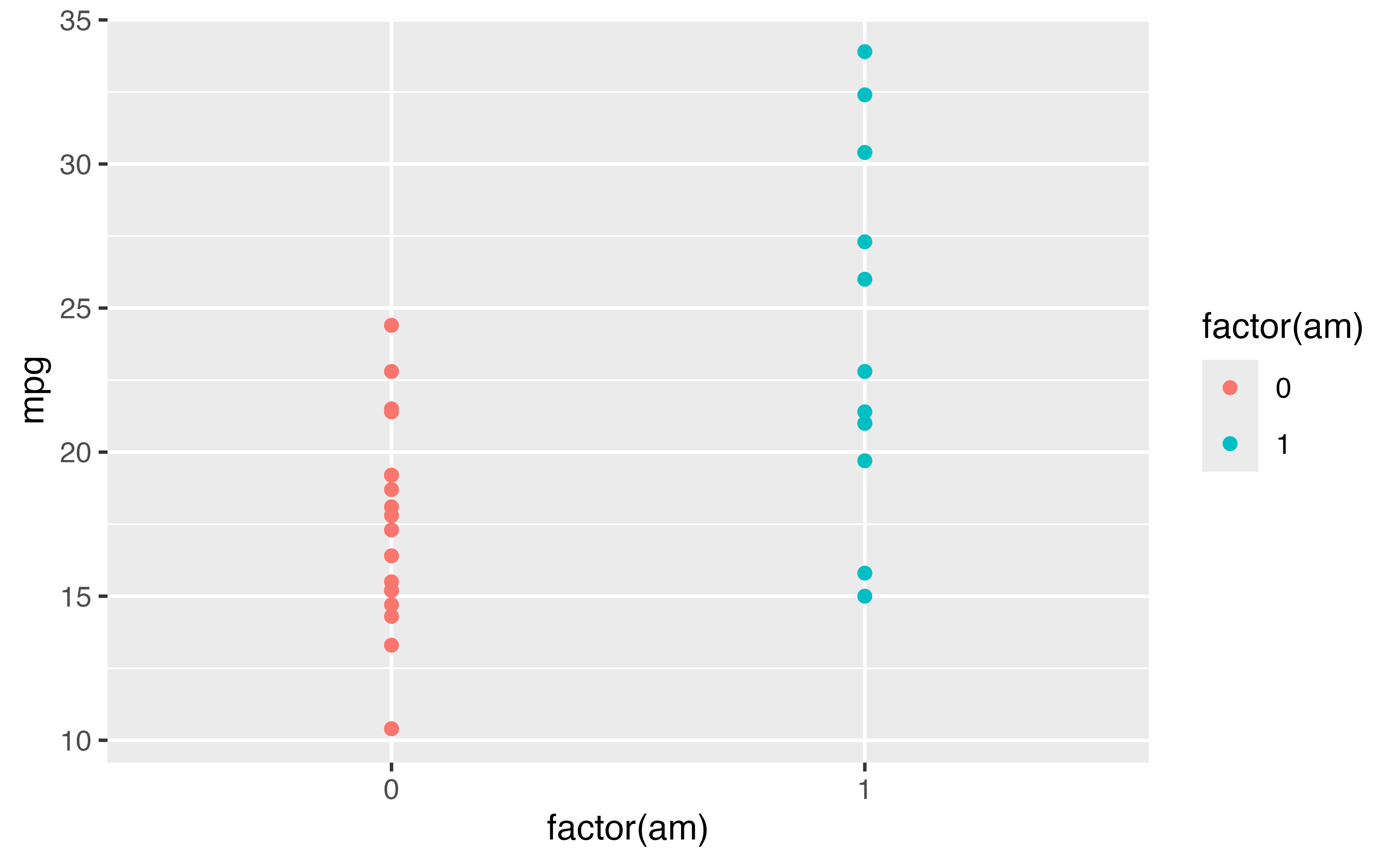
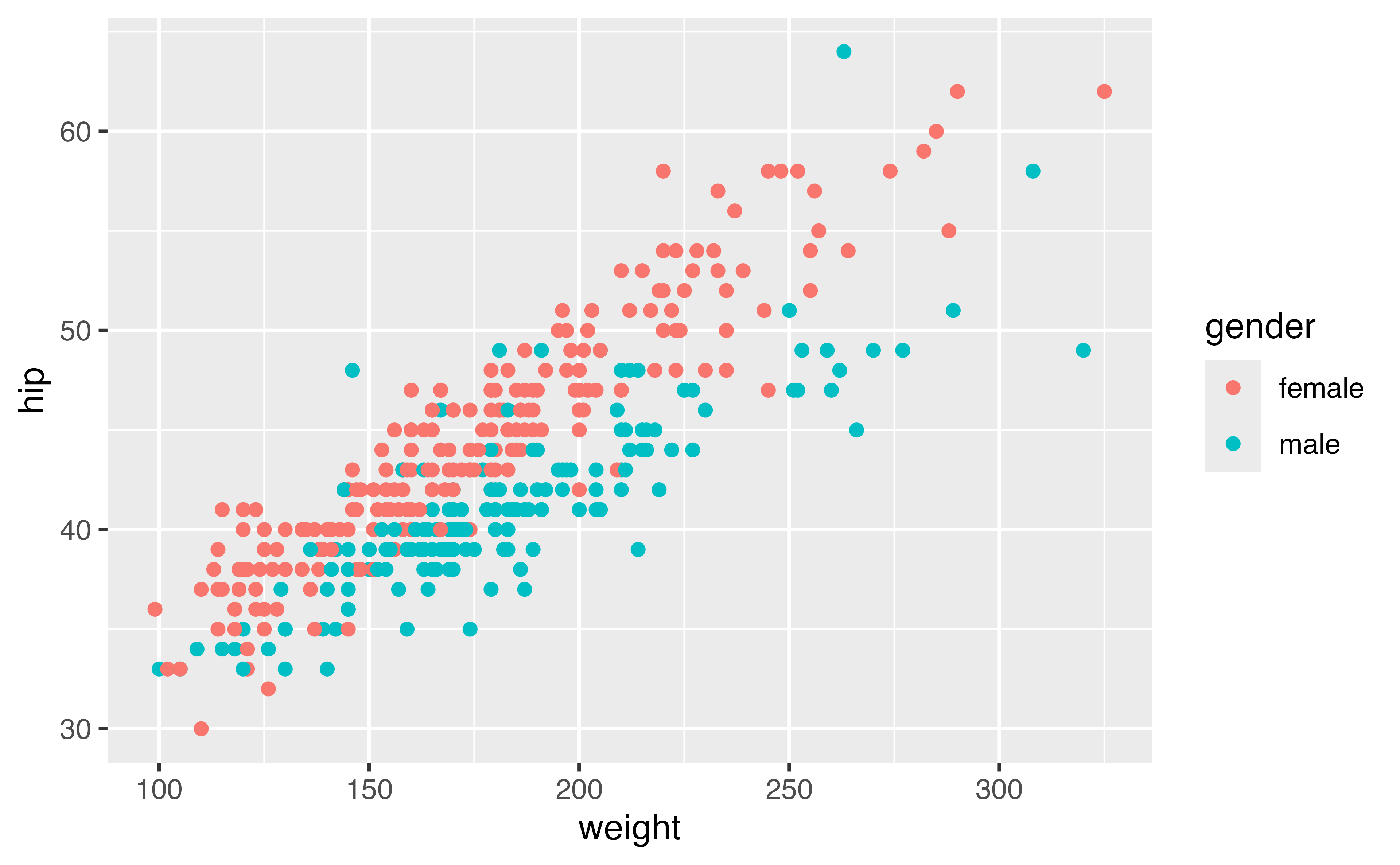
geoms: the shape of the data
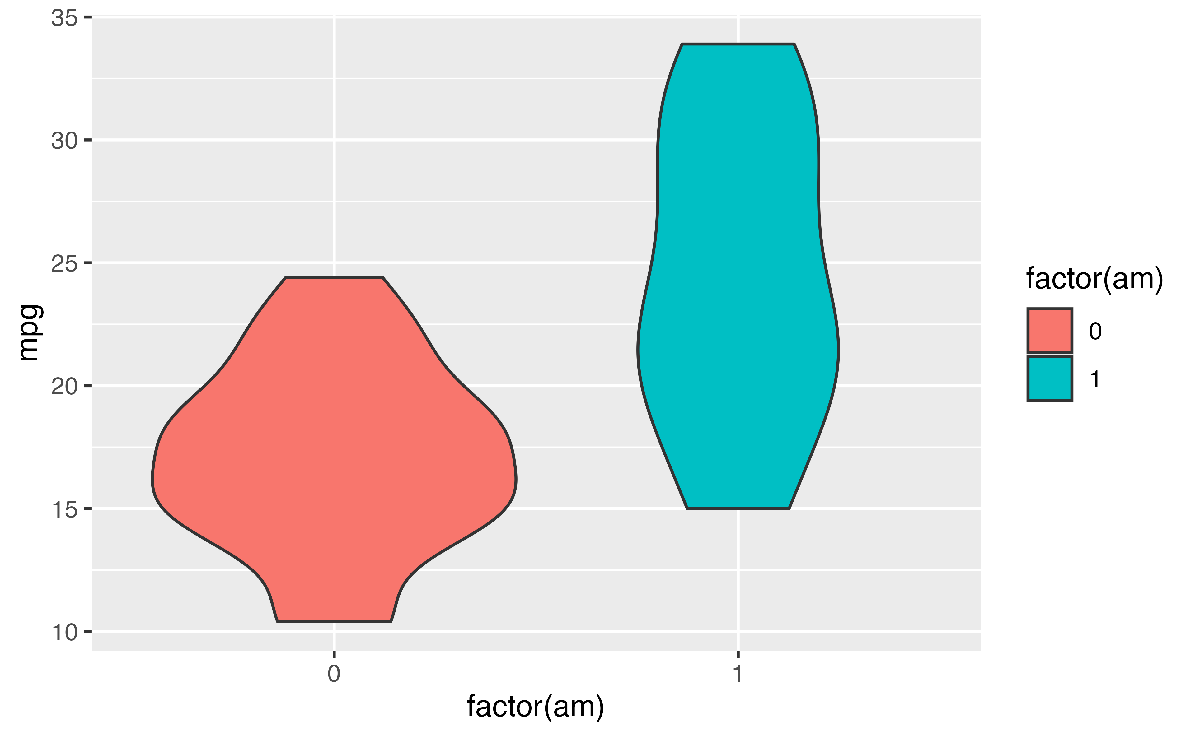
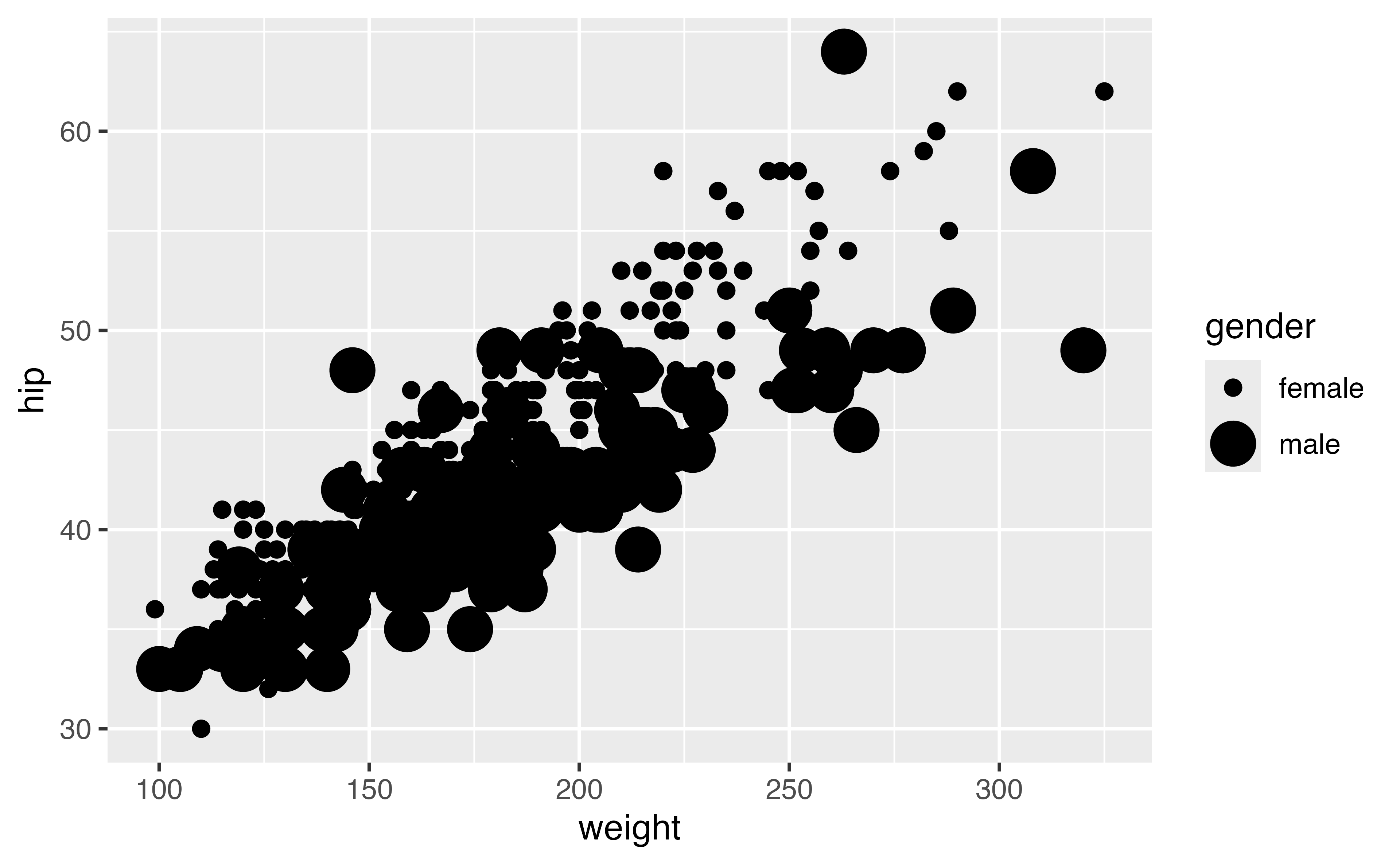
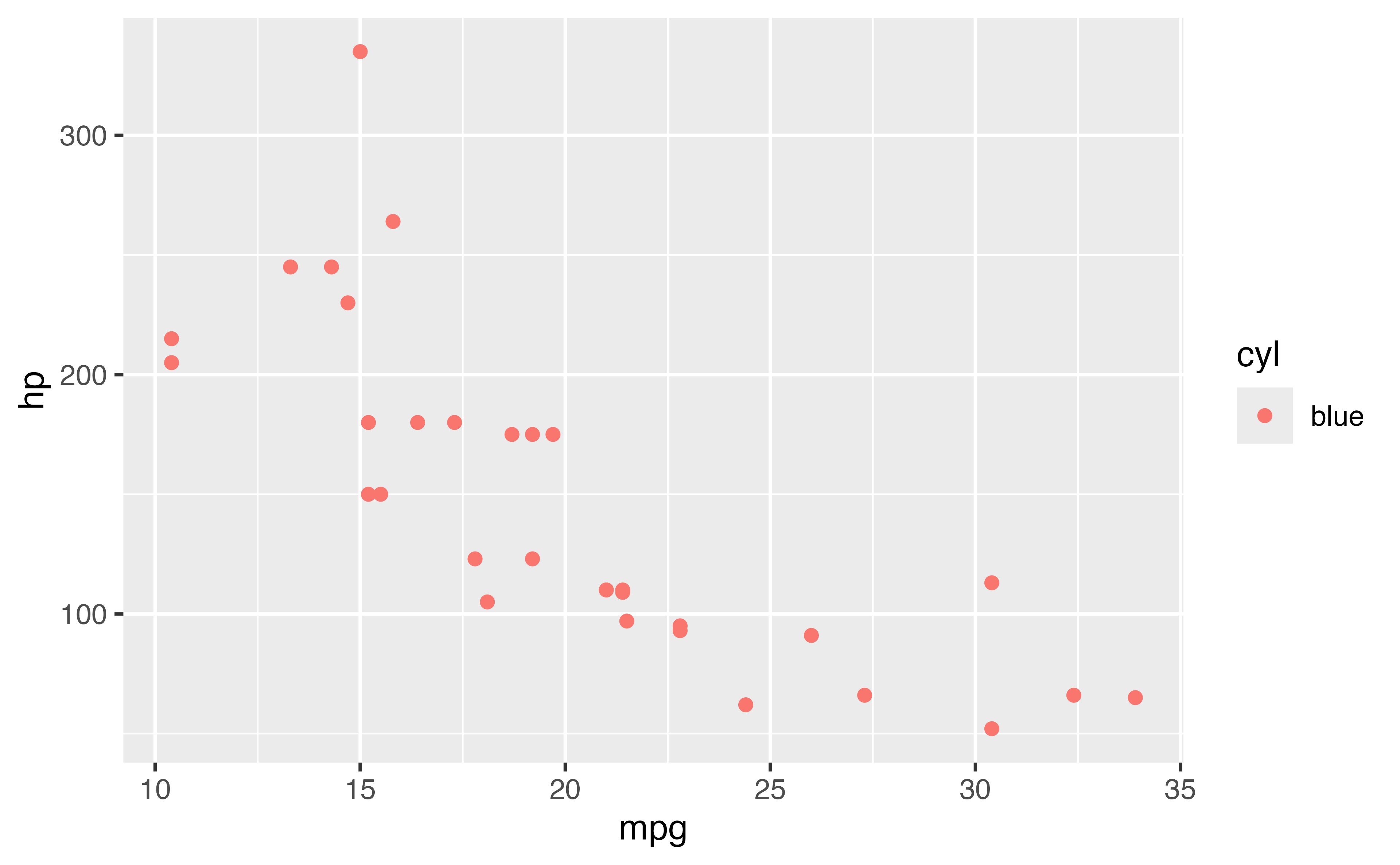
geoms: the shape of the data
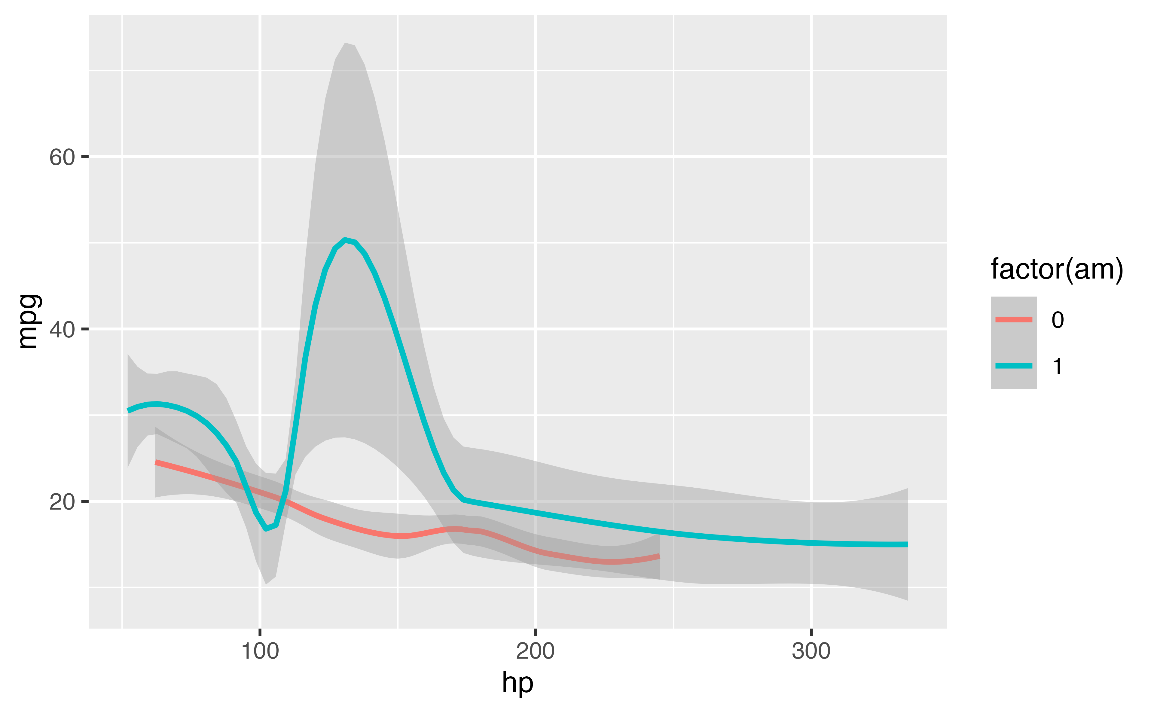
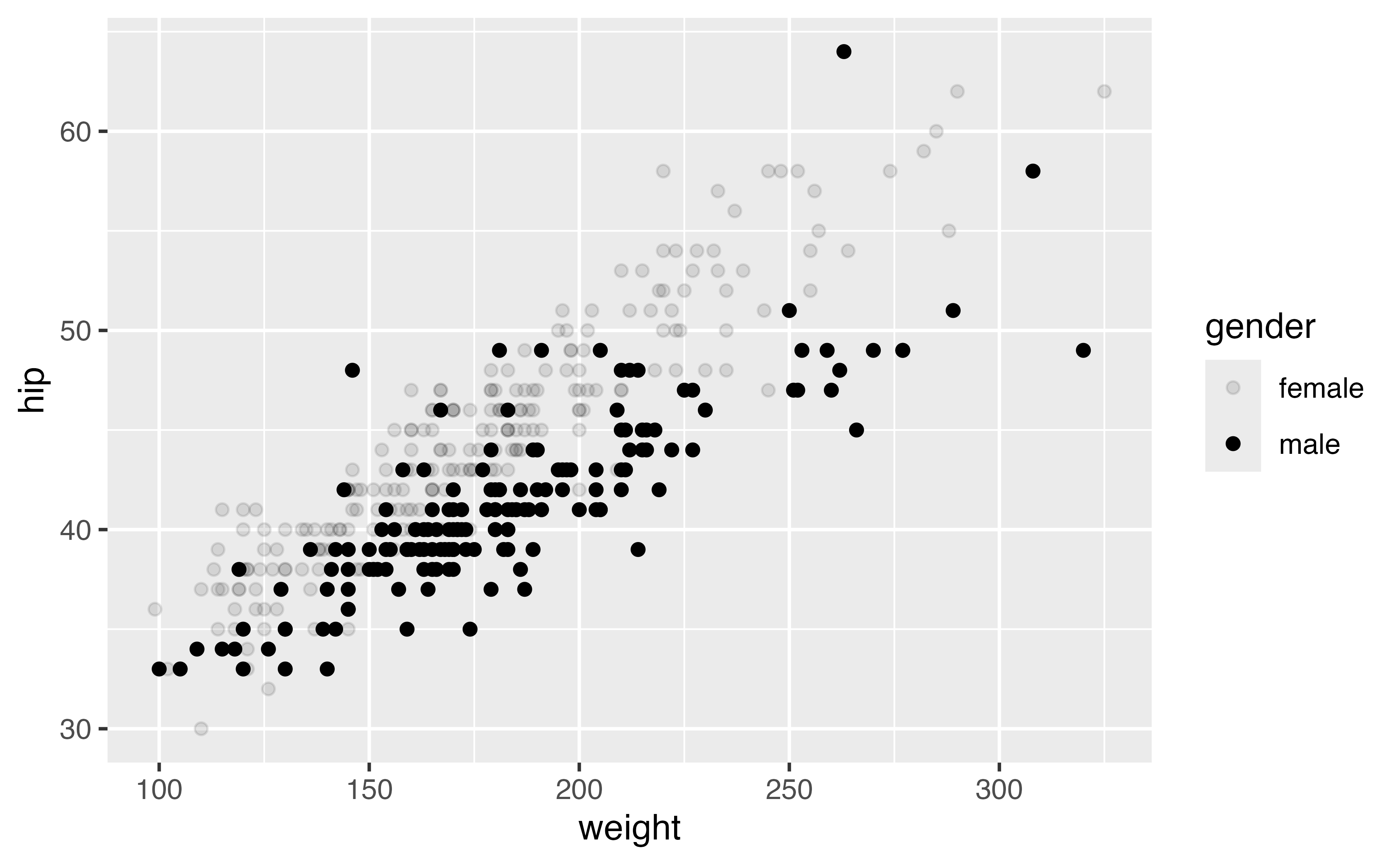
geoms: the shape of the data

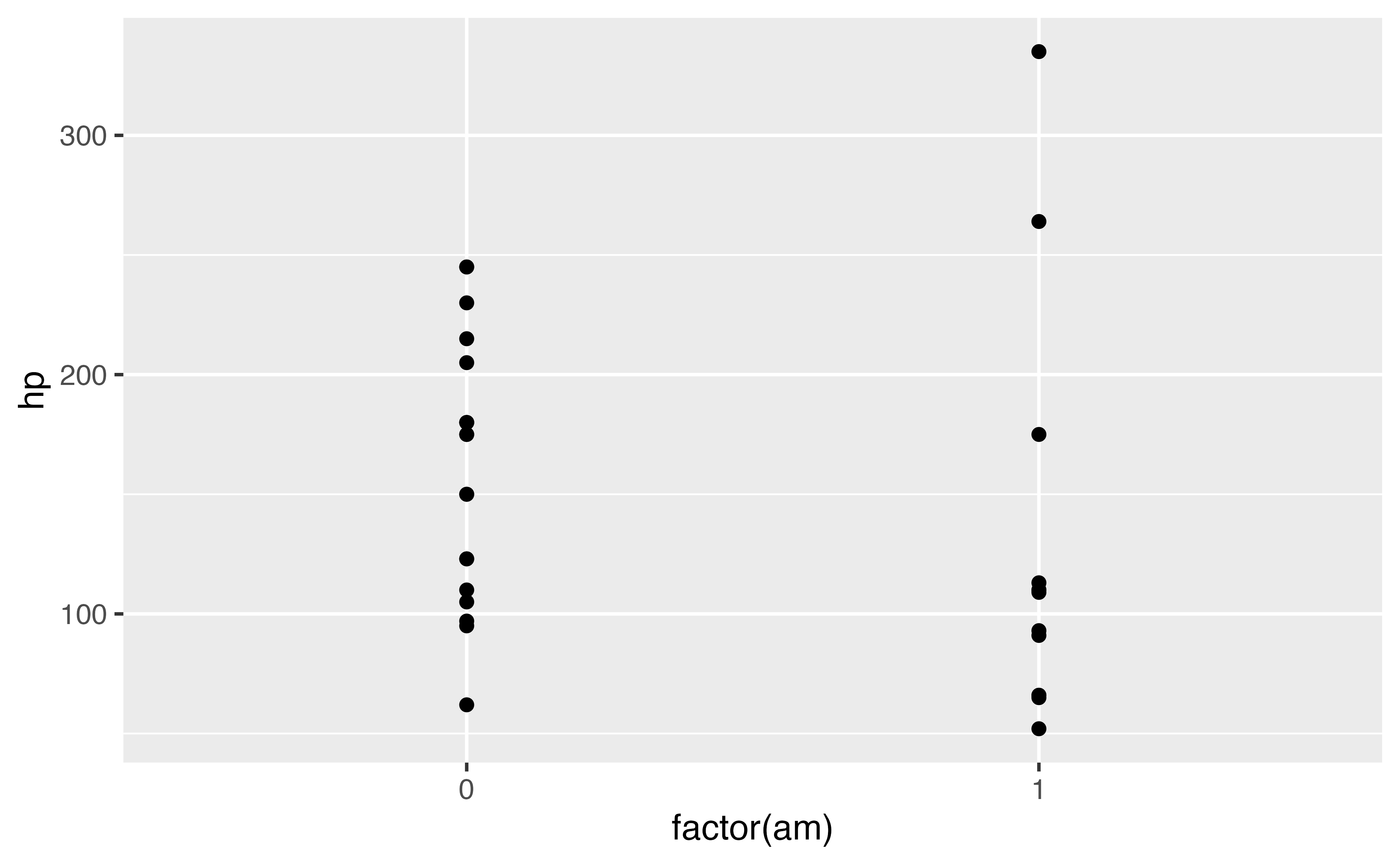
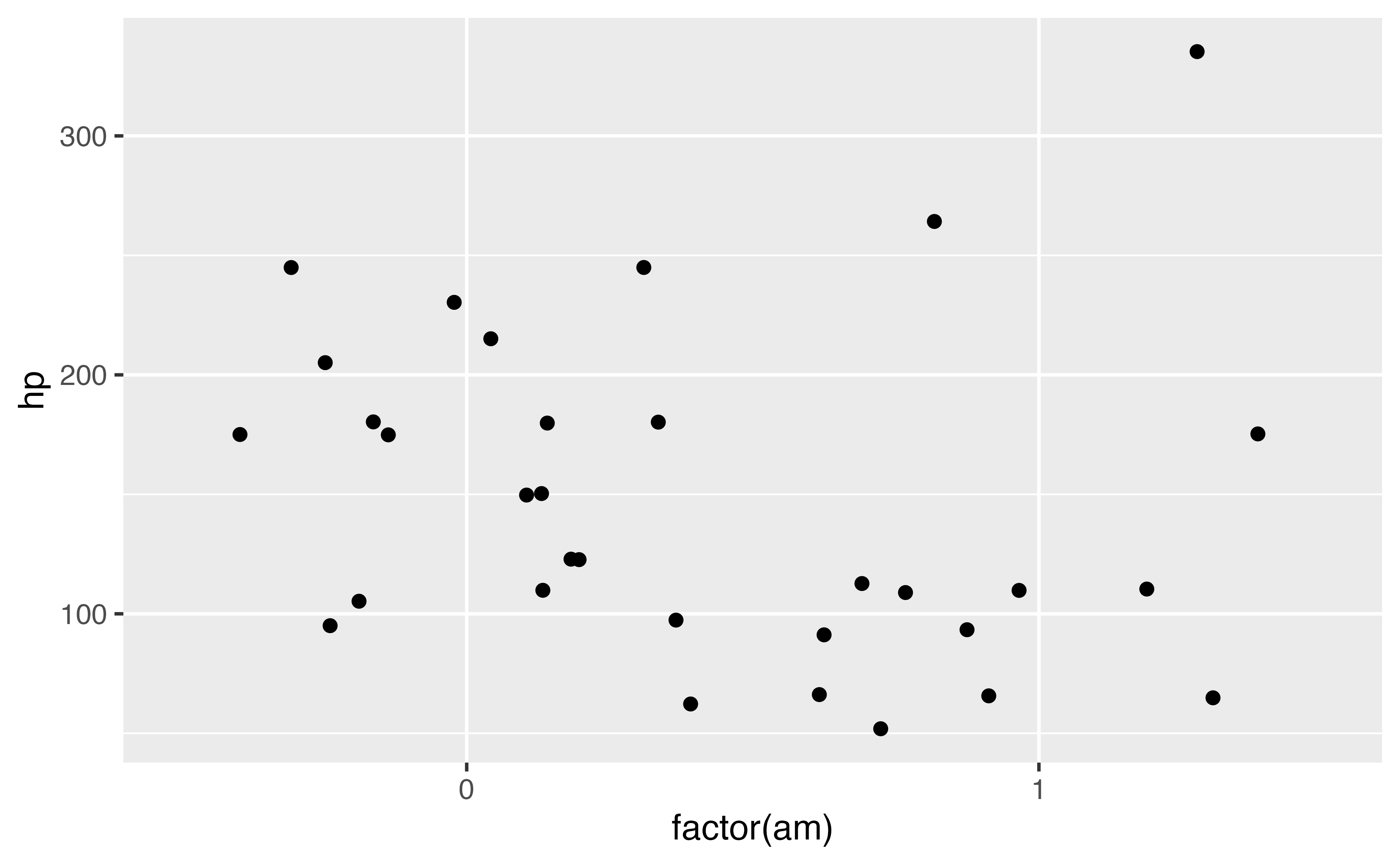
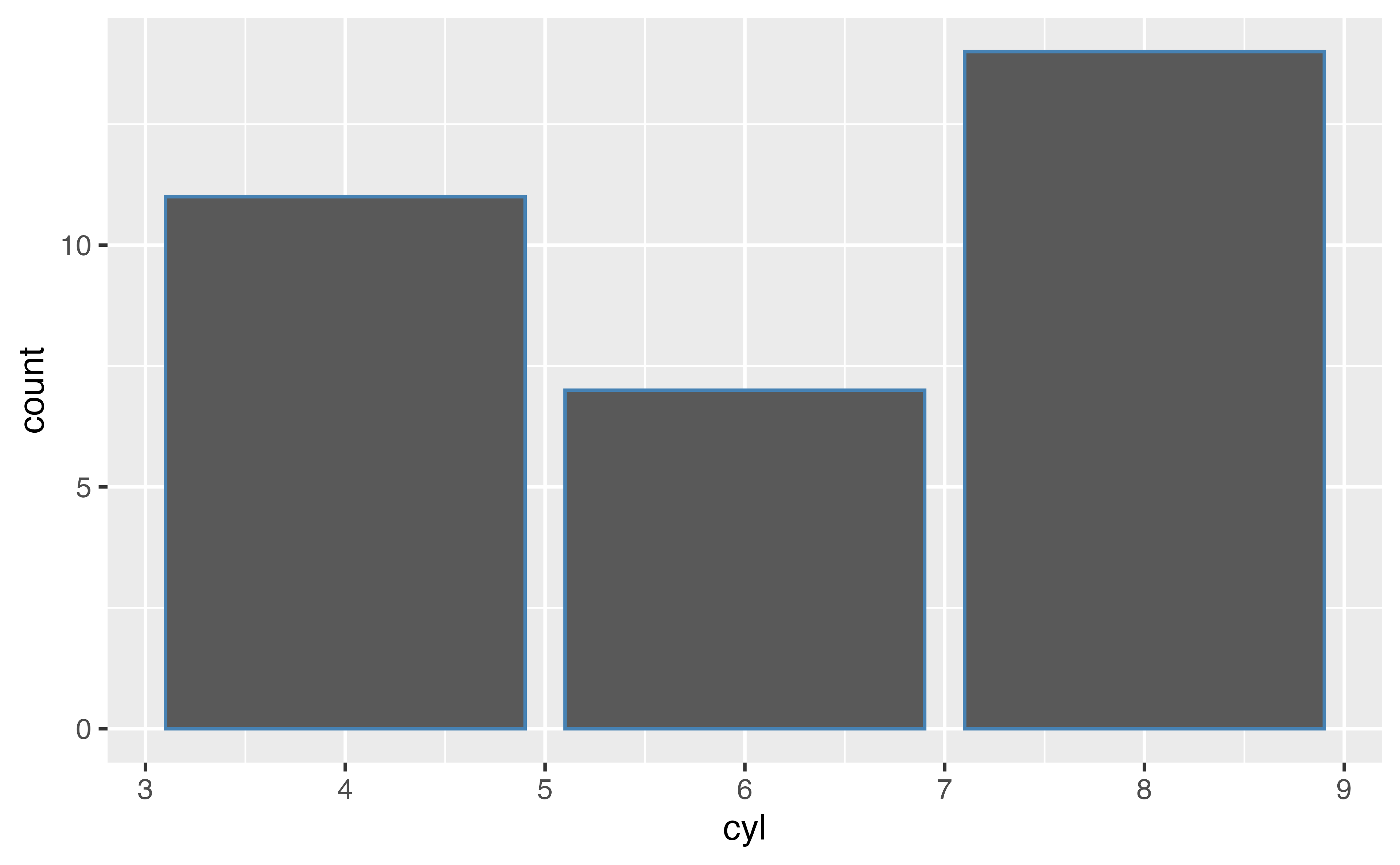
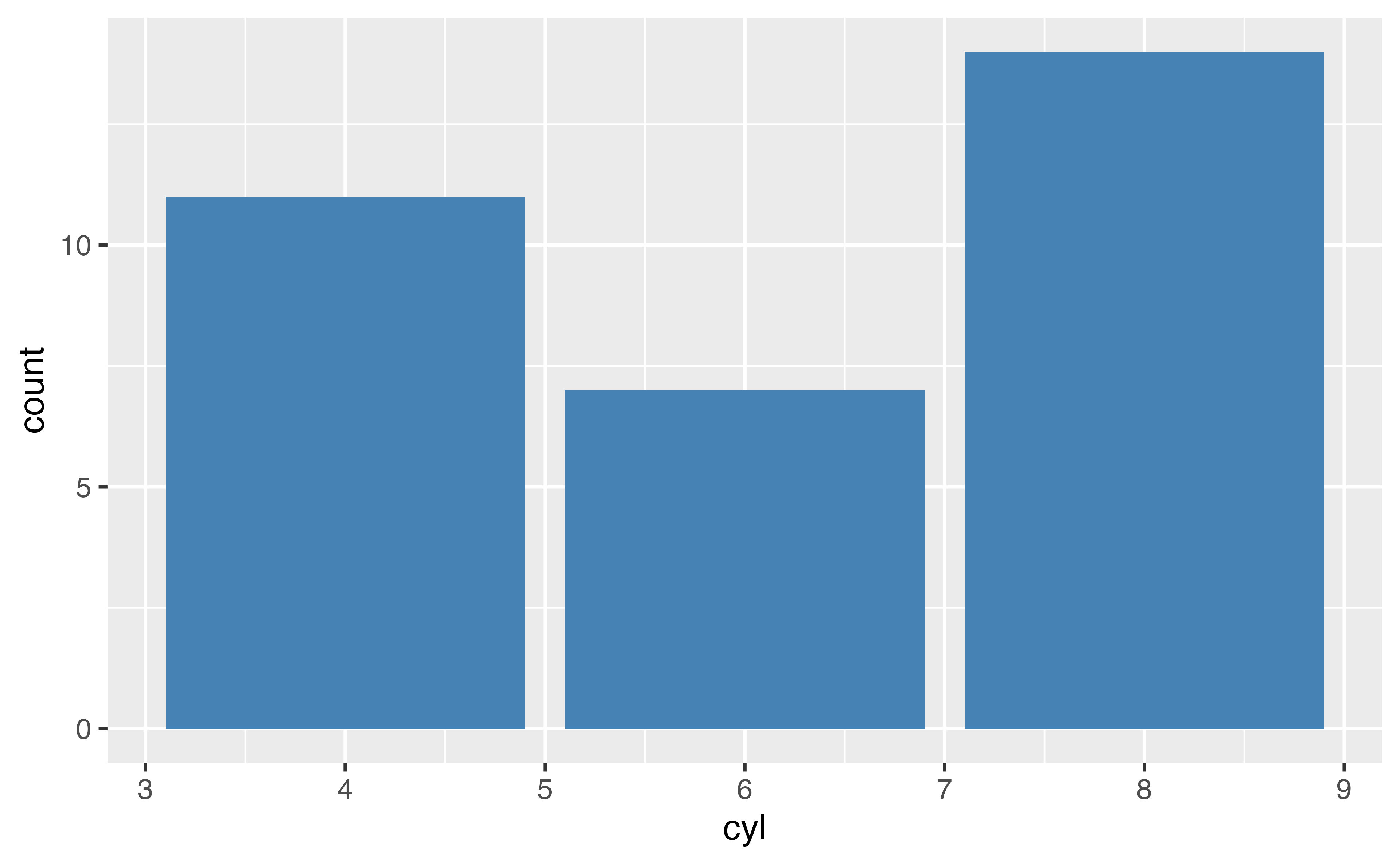


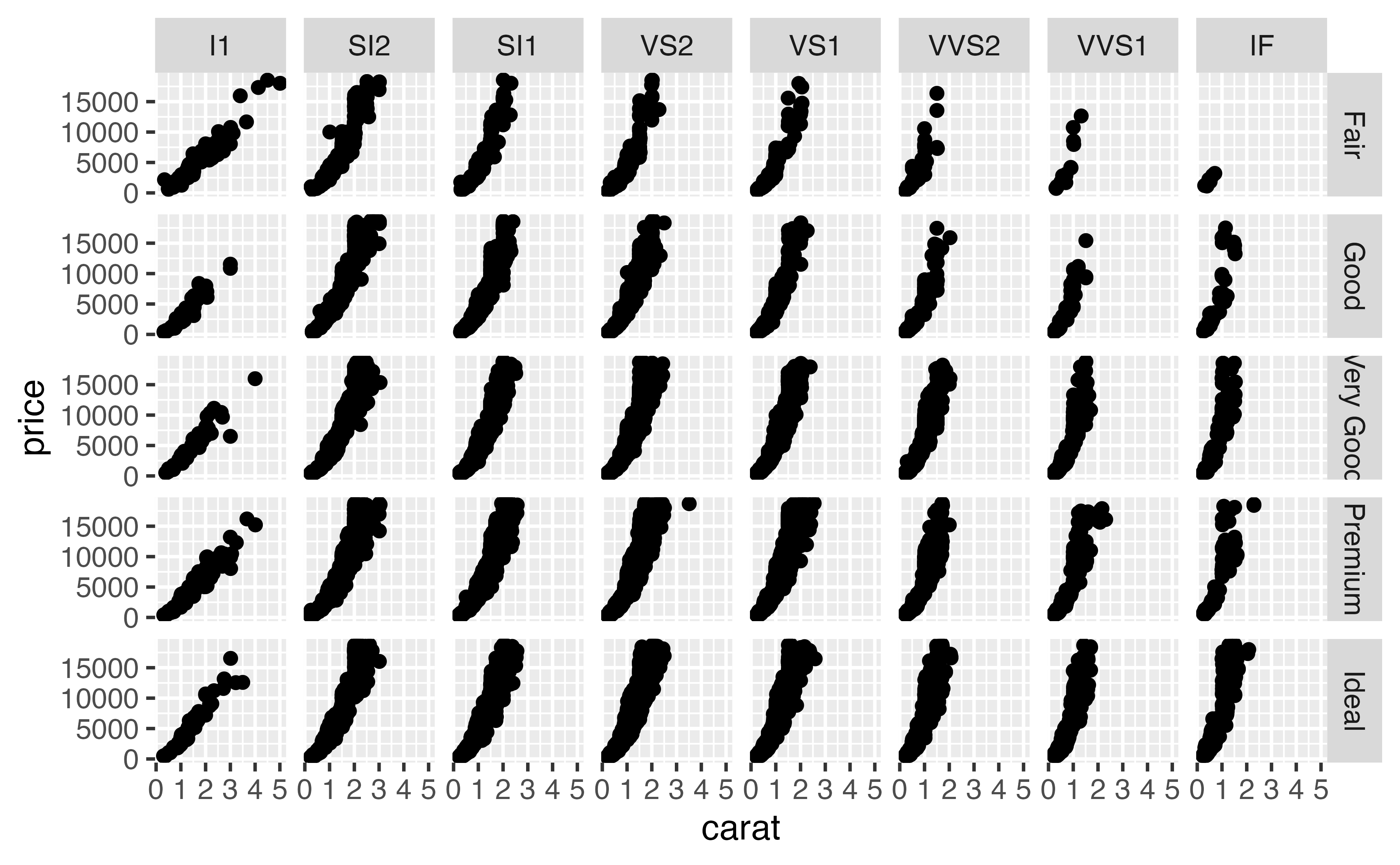
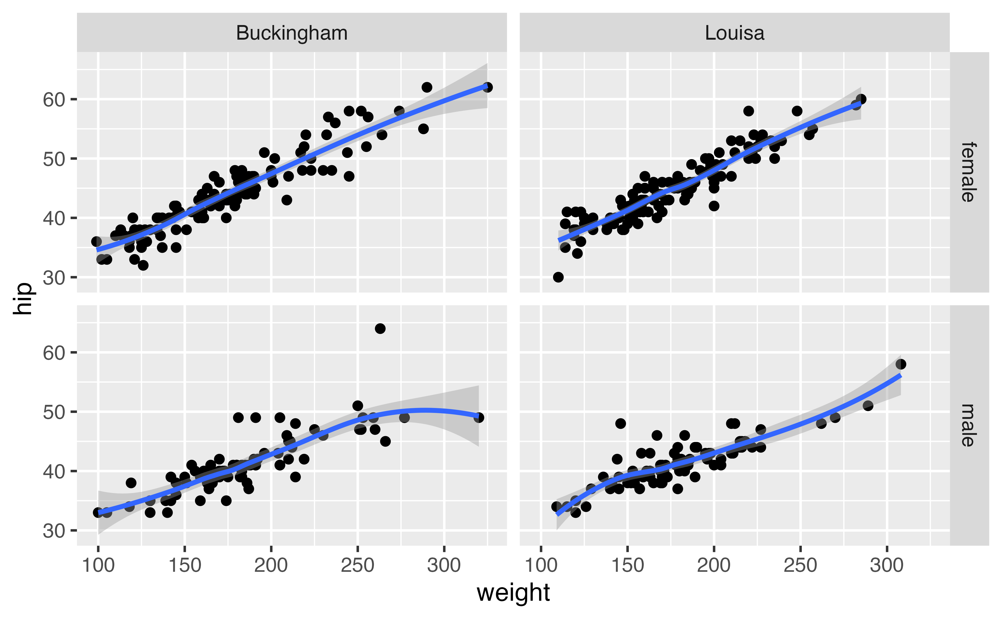
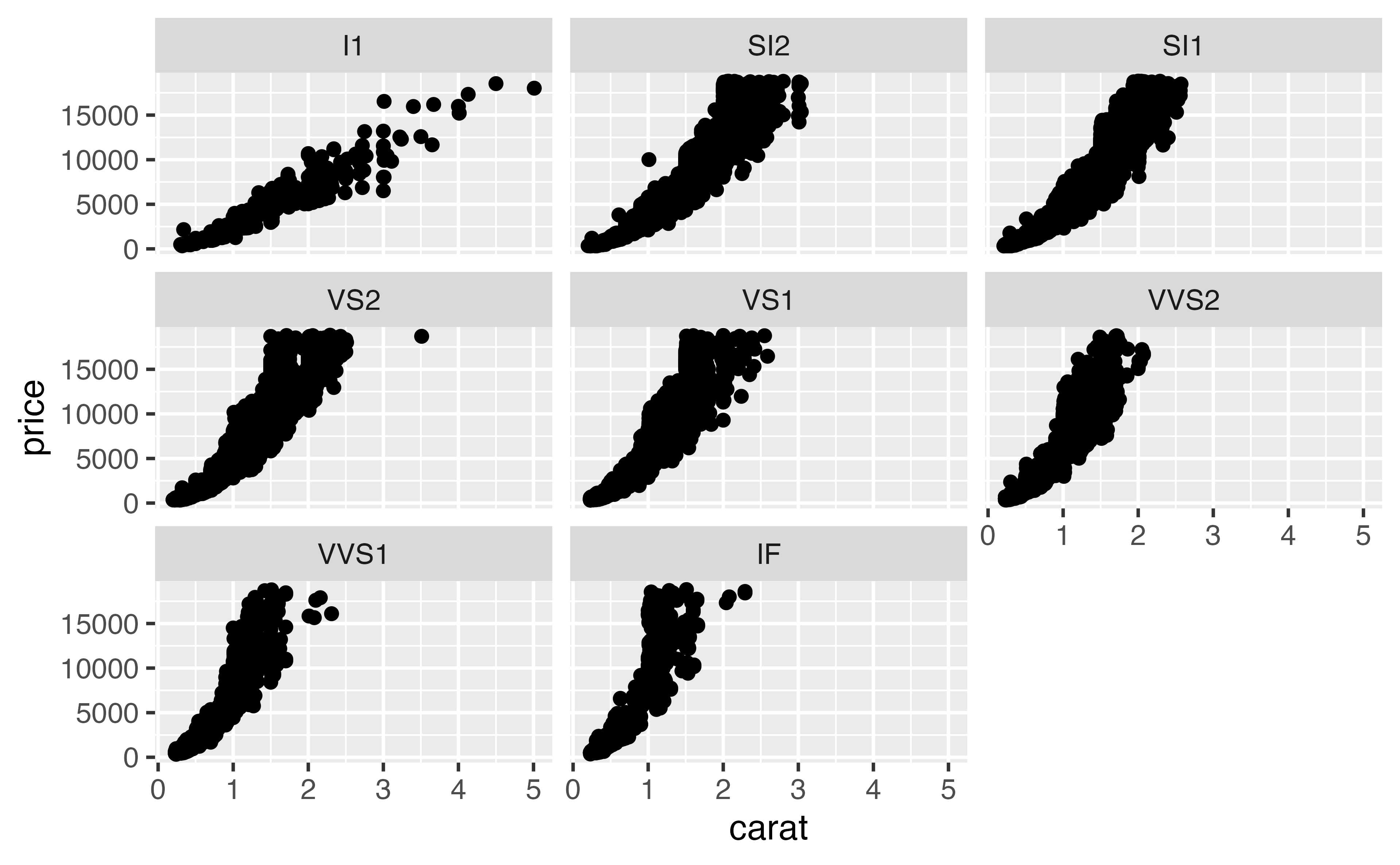
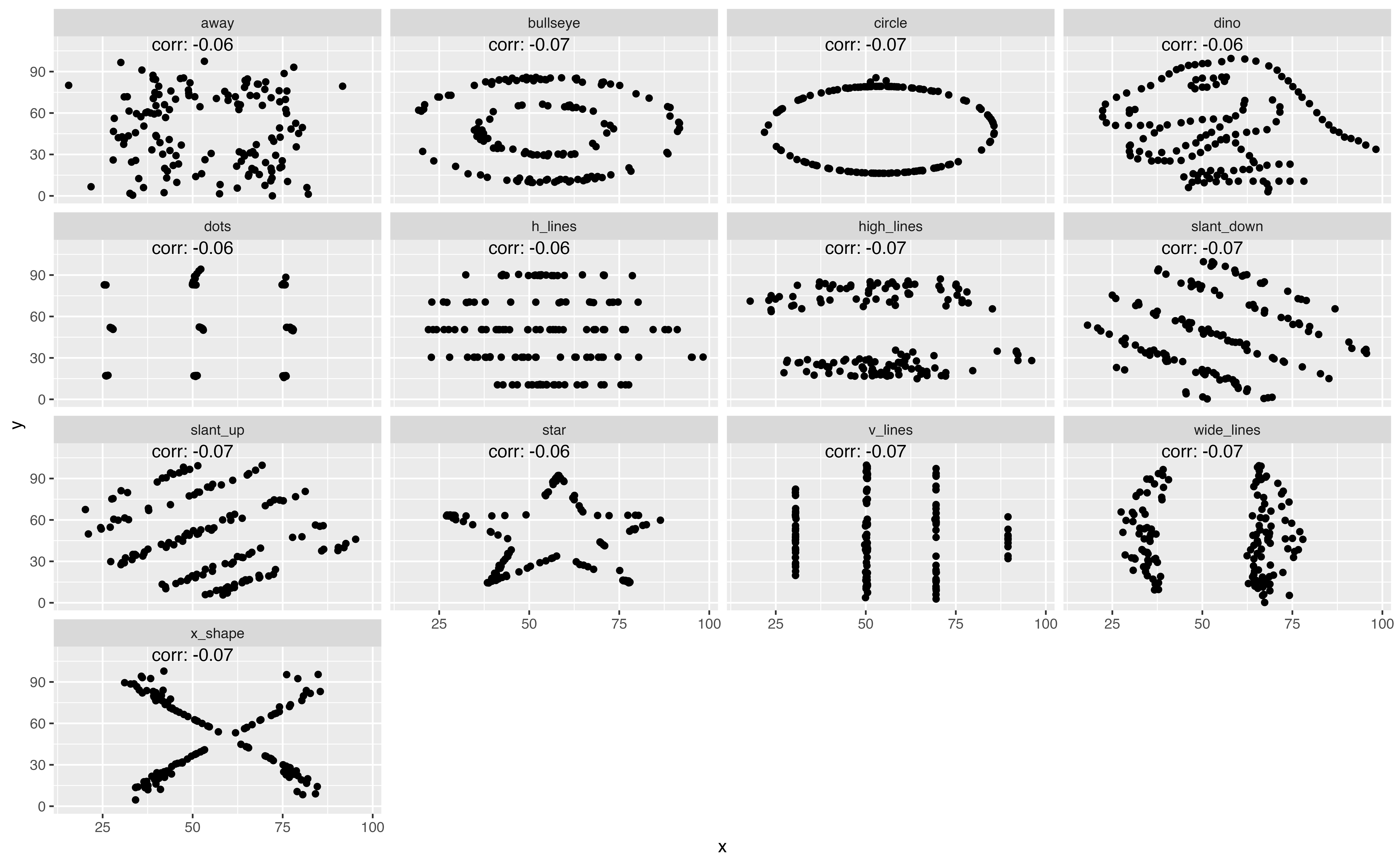
facet_wrap()