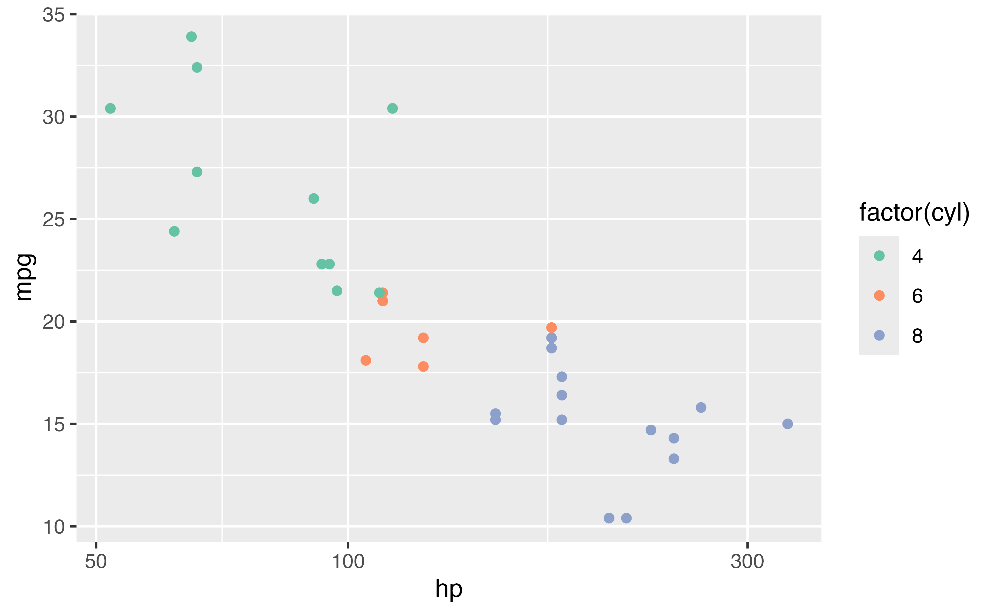
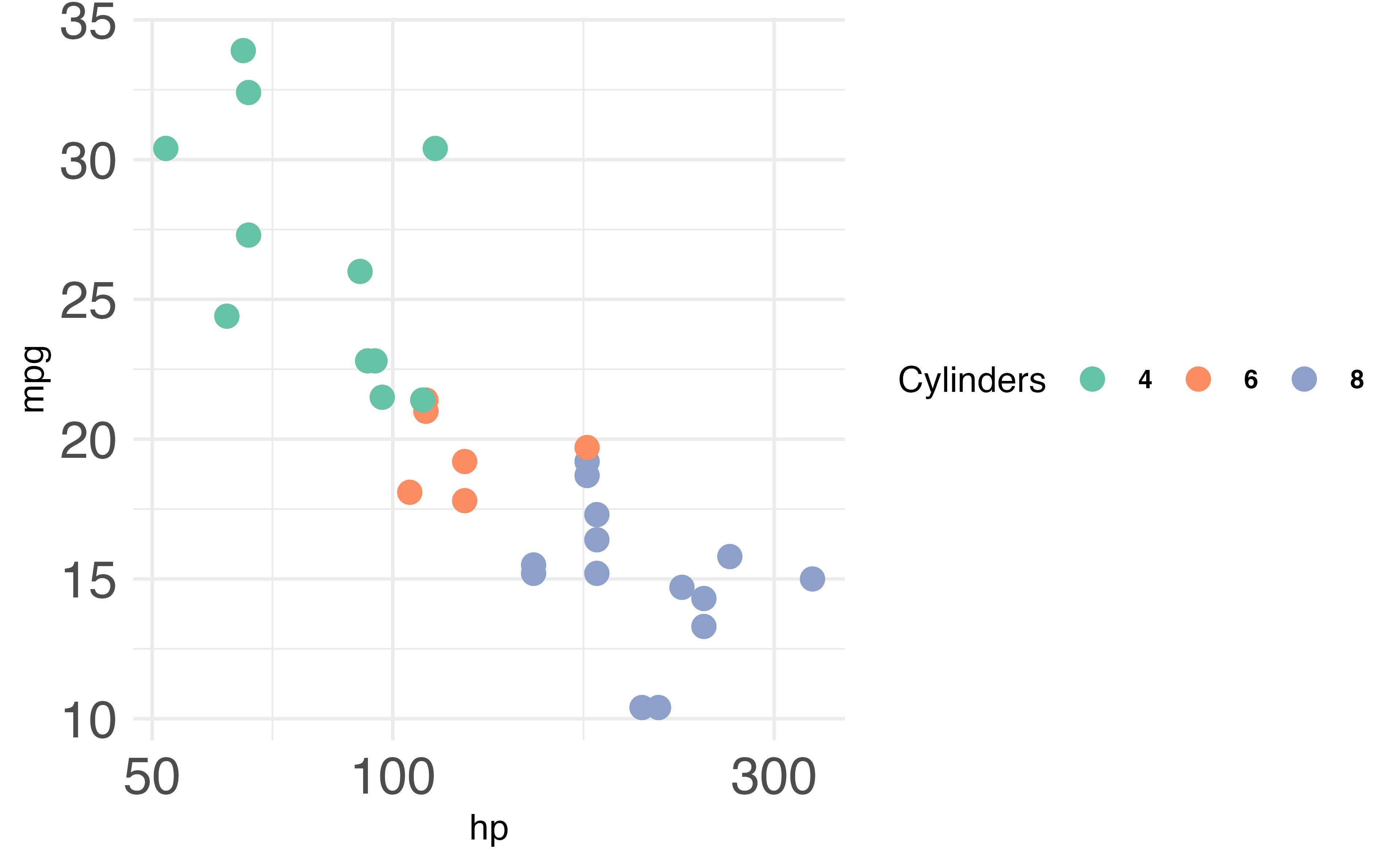
mtcars |>ggplot(aes(hp, mpg, color =factor(cyl))) +geom_point() +scale_x_log10() +scale_color_brewer(palette ="Set2")
Your Turn 10
1. Change the color scale by adding a scale layer. Experiment with scale_color_distiller() and scale_color_viridis_c(). Check the help pages for different palette options.
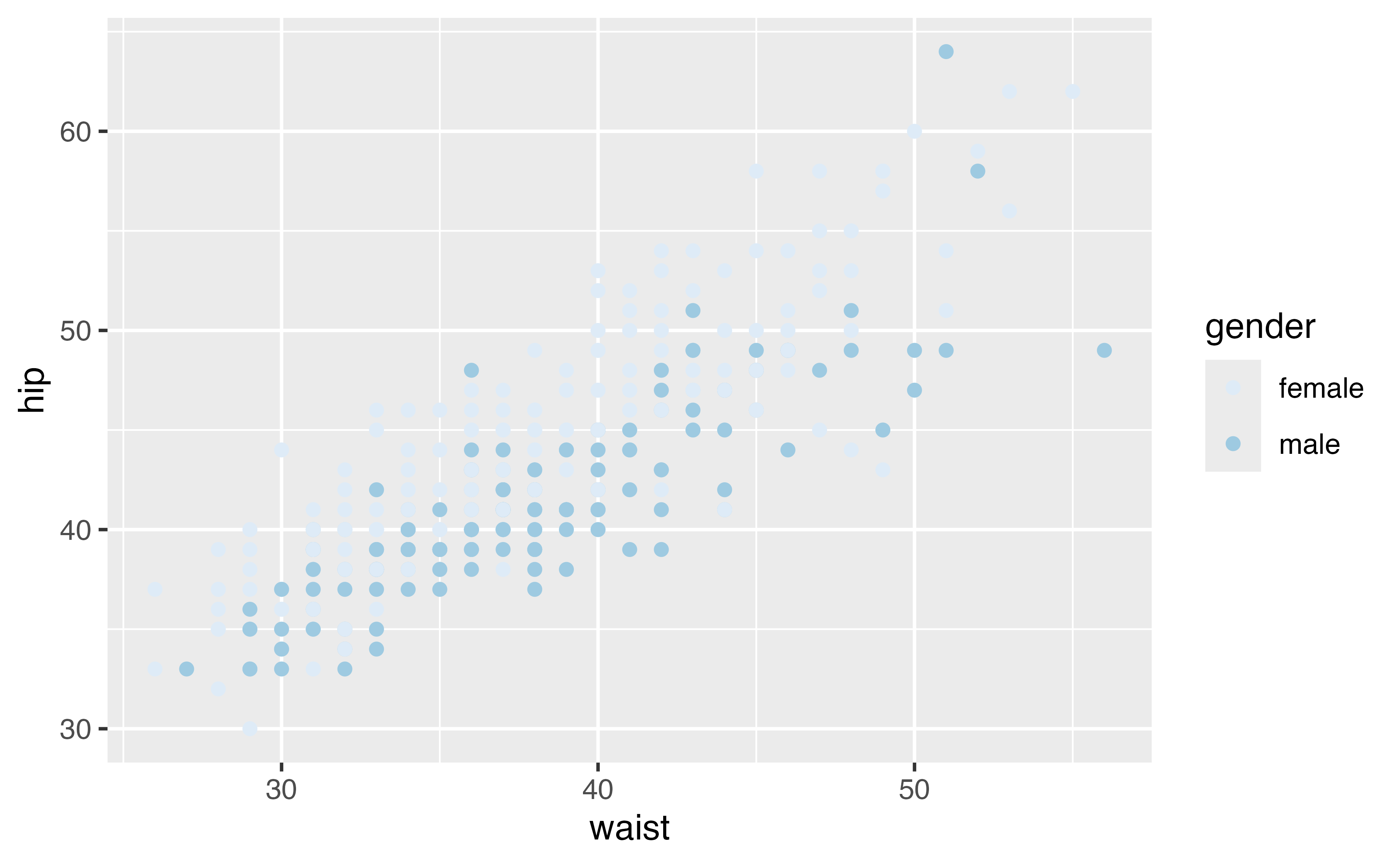
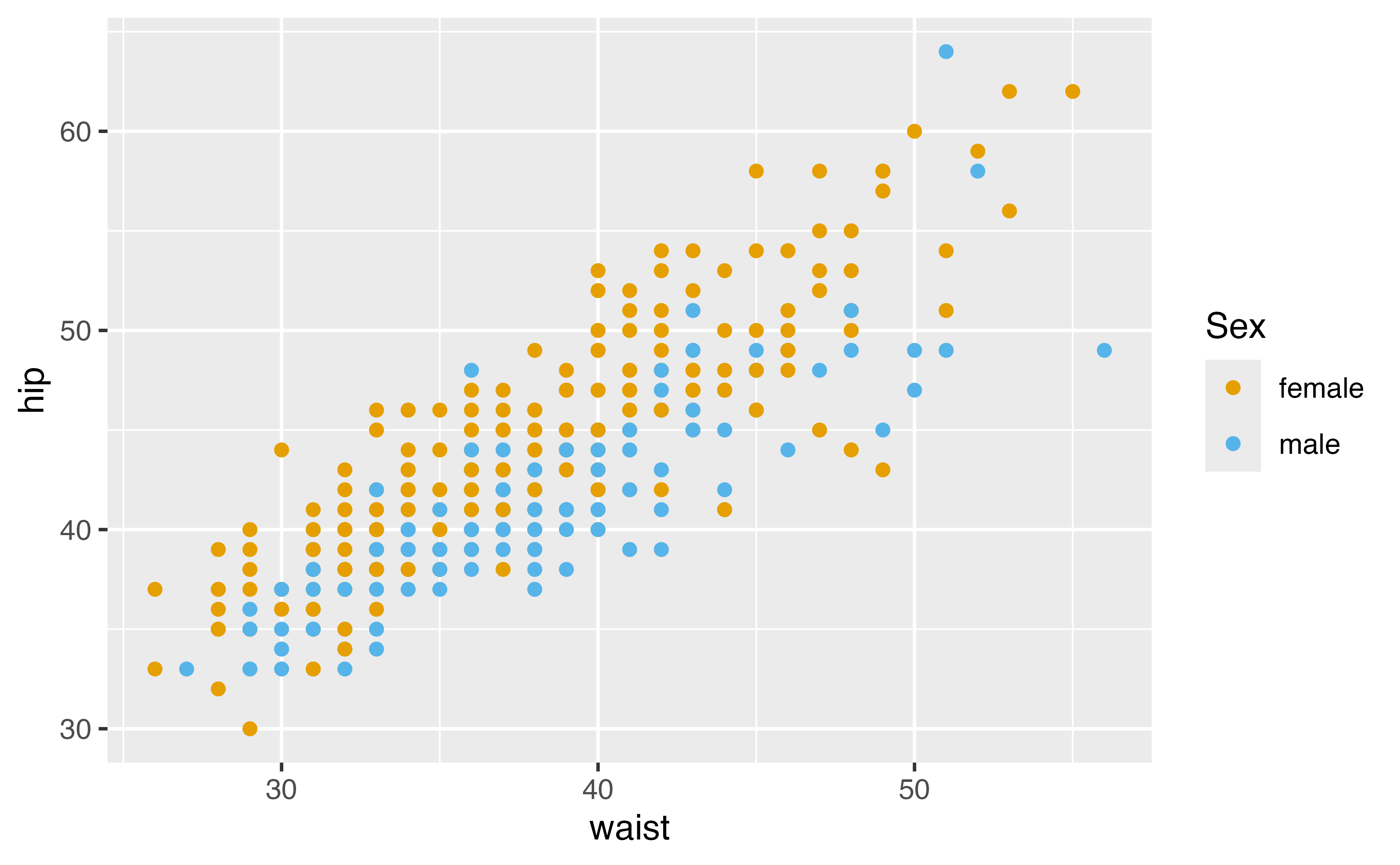
2. Set the color aesthetic to gender. Try scale_color_brewer().
3. Set the colors manually with scale_color_manual(). Use values = c("#E69F00", "#56B4E9") in the function call.
4. Change the legend title for the color legend. Use the name argument in whatever scale function you’re using.
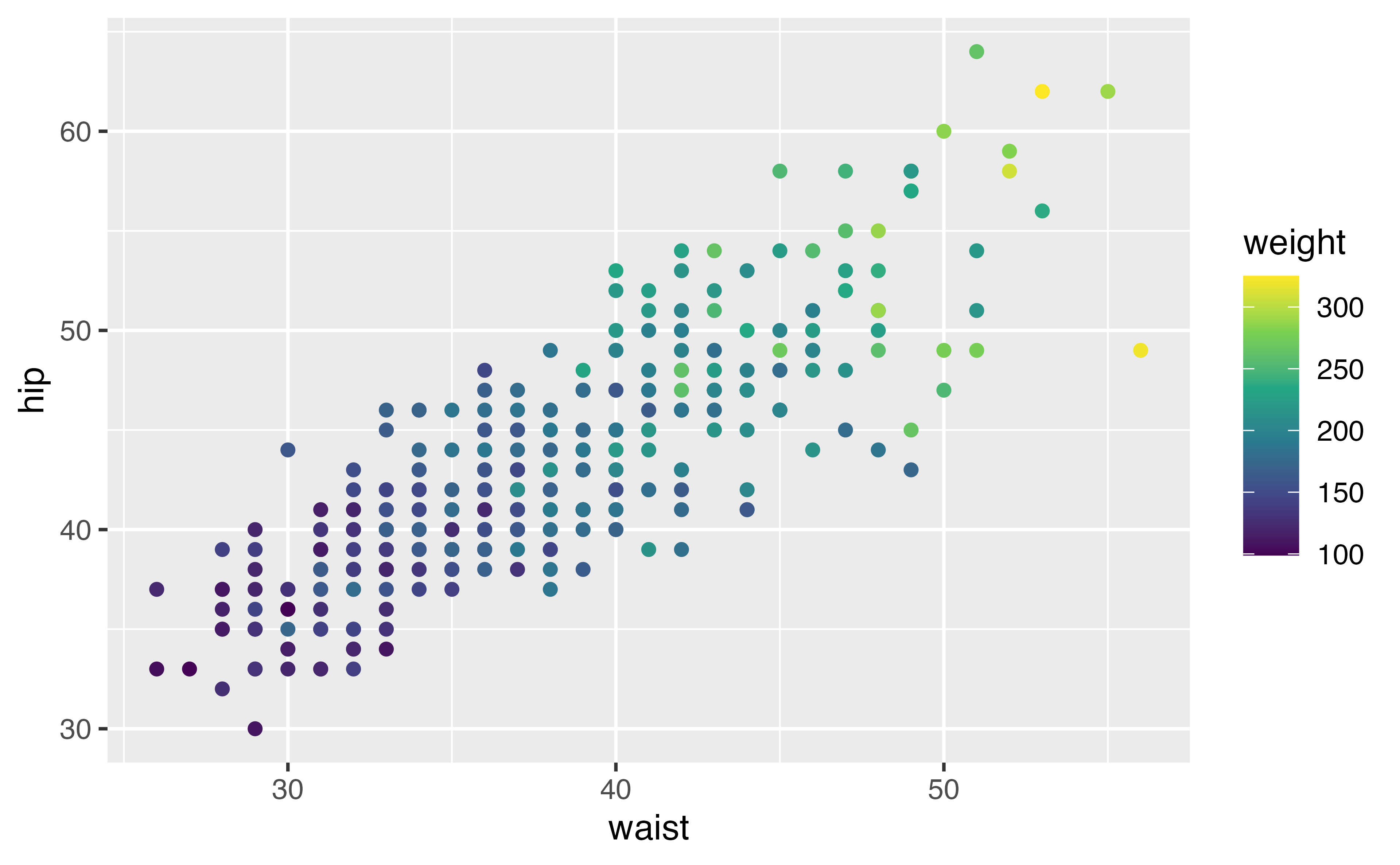
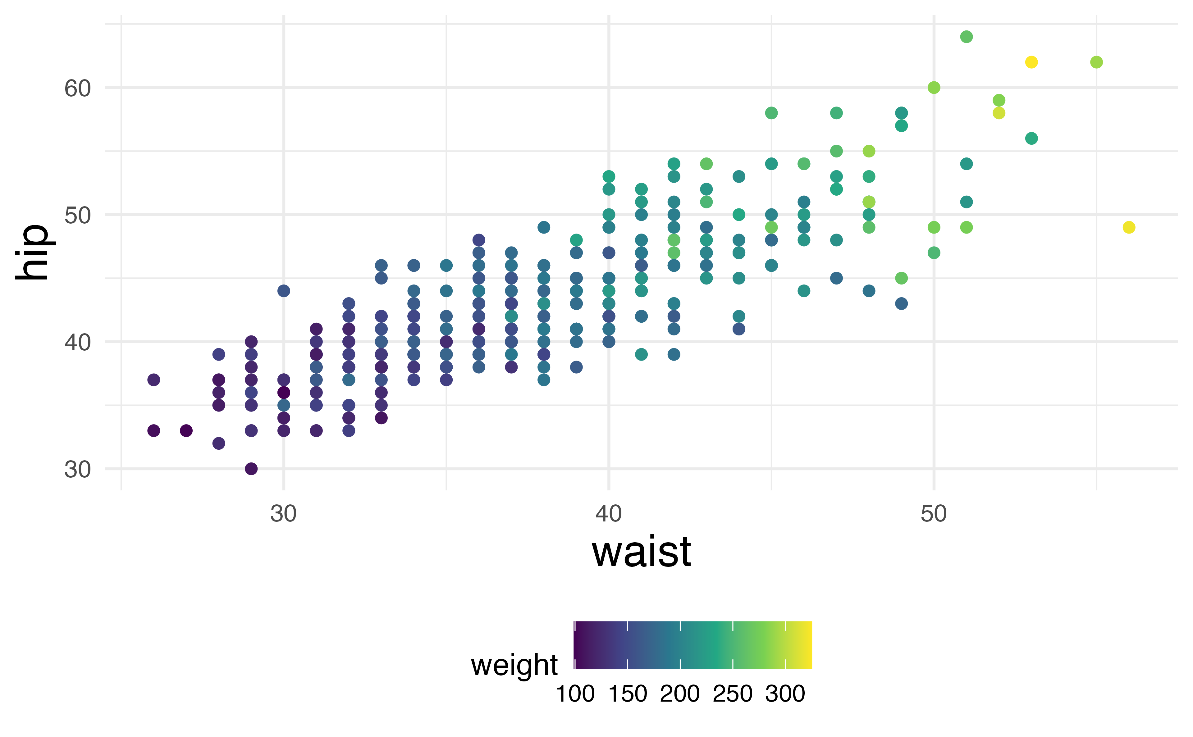
diabetes |>ggplot(aes(waist, hip, color = weight)) +geom_point()
diabetes |>ggplot(aes(waist, hip, color = weight)) +geom_point() +scale_color_viridis_c()
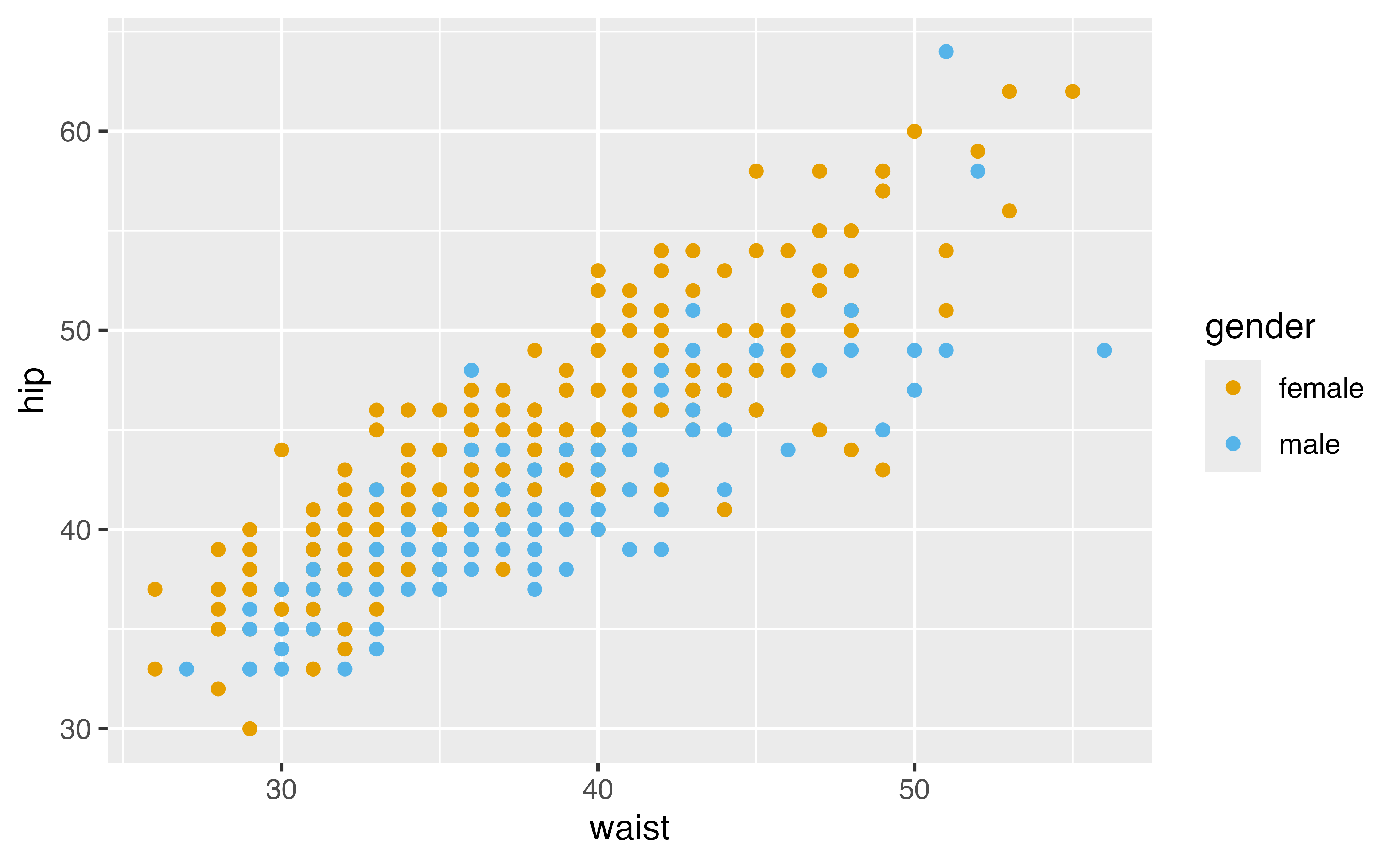
diabetes |>ggplot(aes(waist, hip, color = gender)) +geom_point() +scale_color_brewer()